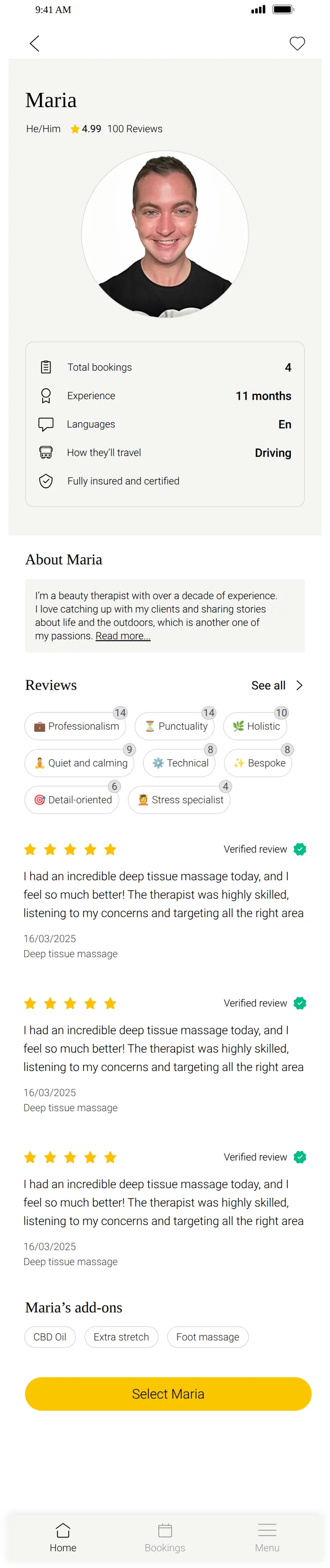
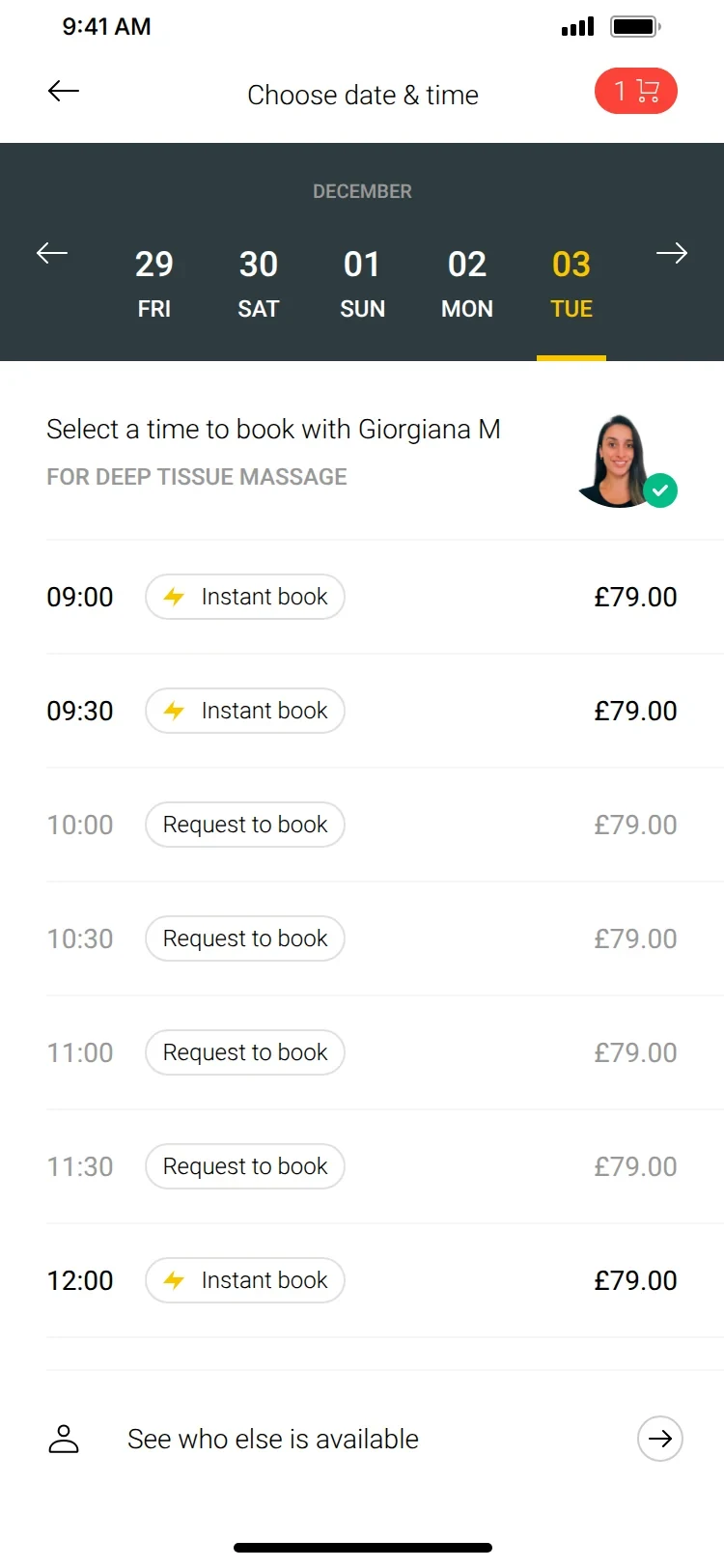
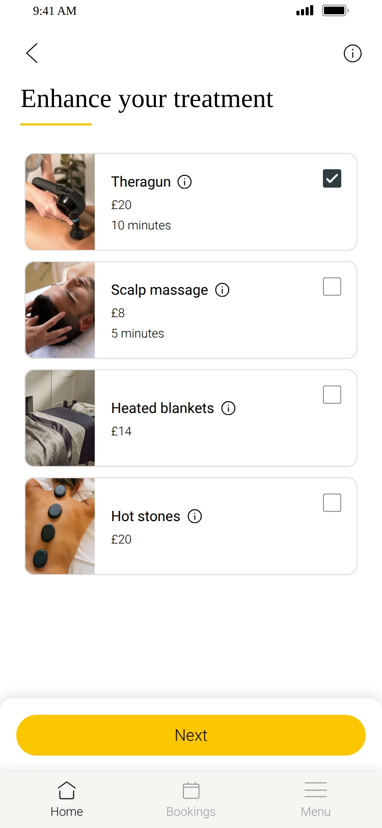
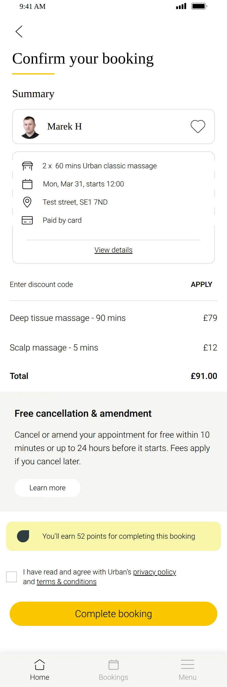
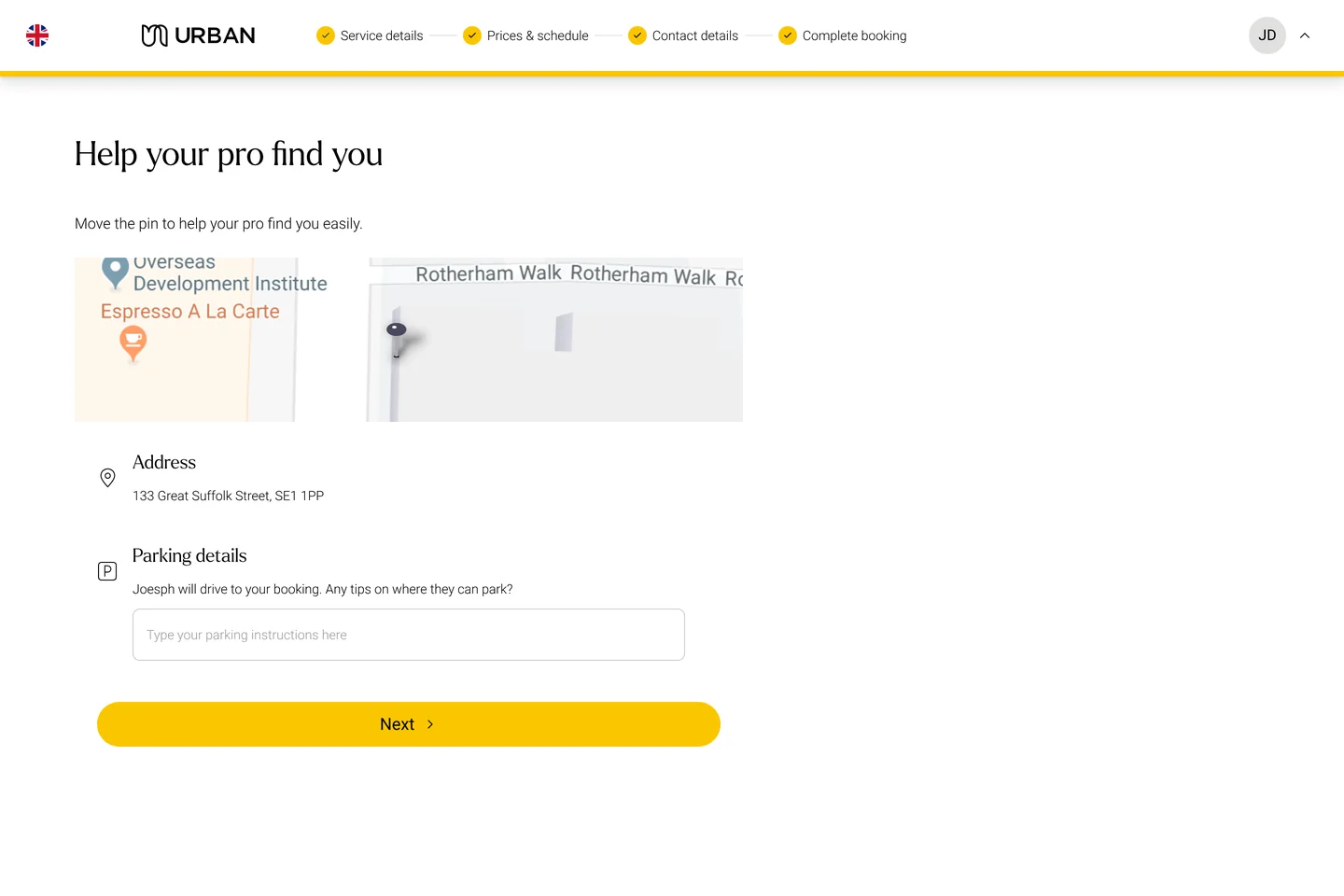
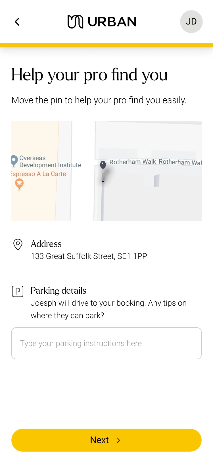
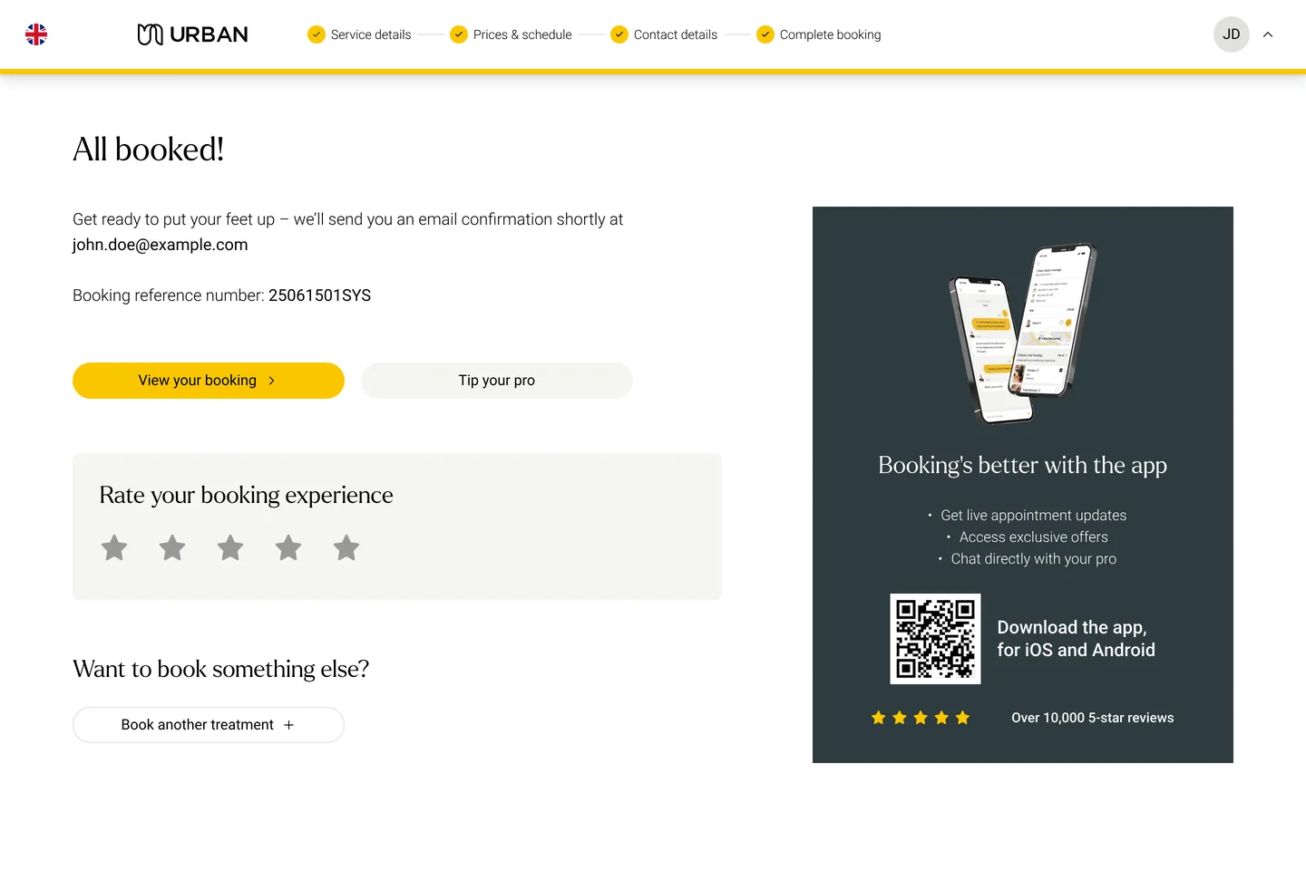
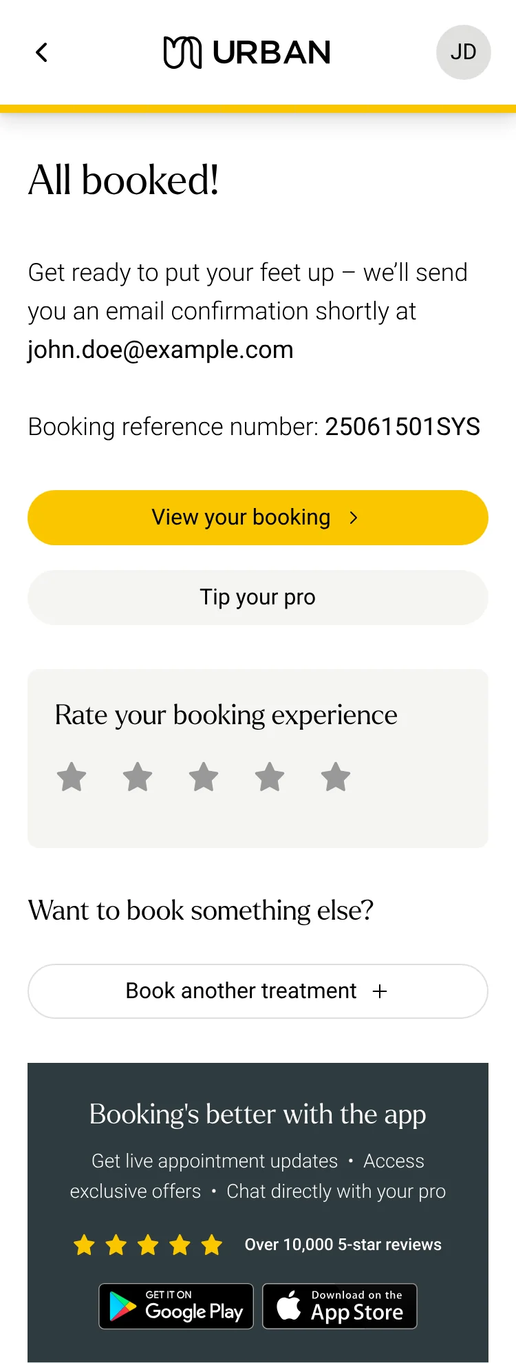
0%of bookings now include parking info, up from 11.7%
20/20testers found add-ons in the redesigned basket, up from 4 of 20
0add-ons sold in the first month after launch
3 moto redesign the customer and practitioner apps on a new platform
Overview
A booking is a chain of connected decisions
Urban is an on-demand wellness marketplace. Customers book professional practitioners who come to their home for massage, physiotherapy, osteopathy and beauty treatments.
Unlike a typical appointment app, every Urban booking coordinates several variables at once. The customer isn’t just picking a slot: they choose a treatment, a time and a practitioner, and the practitioner has to be free, able to travel to them, and priced right.
My work focused on reducing friction from intent to completed booking, across optimisation and new-product work. Often, what looked like a small UX issue was tied to much larger operational, technical or commercial dependencies.
CustomerWho is booking
TreatmentWhat they want
PractitionerWho they prefer
LocationWhere it happens
Travel timeCan the pro get there
AvailabilityIs the pro free
PriceWhat it costs
BookingConfirmed
Design systems ownership
Four design systems across one ecosystem
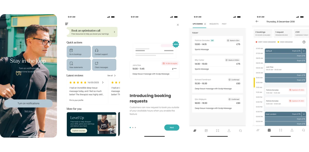
Pro Mobile App
How practitioners manage availability, bookings, customers and their day.
Customer App
The main way customers discover, book, manage and review treatments.
Customer Web App
The same core customer journeys on a responsive web experience.
Manage X
Urban’s internal operations tool, built on Material UI with a substantial layer of custom components and patterns.
01
Parking information optimisation
Turning one missing input into a better arrival for both sides
Before and after
Parking is a real problem in London and the other UK cities Urban serves. Practitioners need to know where to park before they set off.
Urban already asked customers for parking information, but most never gave it. Practitioners could also end up paying for parking or receiving a fine, so a UX gap became an operational and financial problem.
The chain reaction
Missing parking infoThe field is skipped
Hard to find parkingExtra costs or fines
Late arrivalThe treatment starts late
Practitioner frustrationAreas get dropped
Customer frustrationThe experience suffers
Potential churnOn both sides
Practitioner survey
The evidence, chart by chart
What Urban practitioners told us about parking information, and what they do when it’s missing.
Getting no information at all was the biggest problem
Asked which parking problem they face most often, 63 of 97 practitioners chose “I didn’t receive any parking information from the client”, more than four times any other answer.
63 of 97 chose missing information
It happens every week
65% of practitioners hit a parking problem at least once a week, and more than a quarter at least once a day. Only 3% have never had one.
65% at least weekly
Missing information still leads, and rarely comes alone
Across every parking problem they had faced, no information led again, followed by suggested parking that was too far away or too expensive.
78 had received no information
Practitioners quietly withdraw
The most common response was to remove the problematic area from their profile. A booking-flow gap was shrinking supply in the places that needed it most.
40 remove the area from their profile
01Most frequent problem
Getting no information at all was the biggest problem
Asked which parking problem they face most often, 63 of 97 practitioners chose “I didn’t receive any parking information from the client”, more than four times any other answer.
63 of 97 chose missing information
02How often
It happens every week
65% of practitioners hit a parking problem at least once a week, and more than a quarter at least once a day. Only 3% have never had one.
65% at least weekly
03Every problem faced
Missing information still leads, and rarely comes alone
Across every parking problem they had faced, no information led again, followed by suggested parking that was too far away or too expensive.
78 had received no information
04How they respond
Practitioners quietly withdraw
The most common response was to remove the problematic area from their profile. A booking-flow gap was shrinking supply in the places that needed it most.
40 remove the area from their profile
The input already existed. But after paying, customers think “my booking is done.”
So I didn’t just make the field more visible. I tested placement and timing in Maze around three questions, and each answer shaped the final flow.
01Where should we place it?
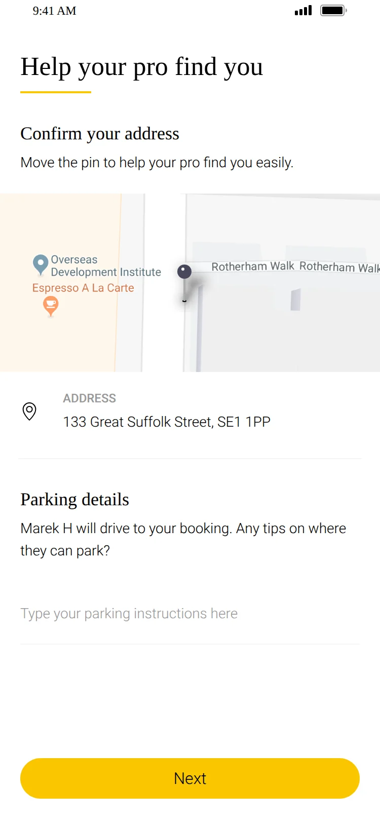
In the flow, as a dedicated bottom sheet. Out of a secondary tab and into the moment customers are still engaged with their booking.
02When should we show it?
Between payment and confirmation. Earlier adds friction to a high-intent step. After the success screen, customers feel done and leave.
03When should we not show it?
Whenever the practitioner isn’t driving. Travel mode from the Pro App decides, so customers are never asked for details that won’t be used.
Outcome
Parking info completion rose from 11.7% to 92%
The problem was never a missing input. It was the visibility, timing and relevance of the interaction.
Small UX problems can create disproportionately large operational ones. The fix came down to three simple questions: where to place it, when to show it, and when not to.
This became a recurring principle in my work at Urban: good product design is often less about adding functionality and more about putting the right interaction in the right context.
02
Add-ons
Increasing order value without adding friction to booking
The business wanted a higher average order value. Customers wanted lower-cost extras to personalise their treatment. Add-ons could serve both.
But add-ons weren’t a simple bolt-on. Whether one could be offered depended on a web of existing variables, and a customer could book several services from the same practitioner, each with its own set of compatible add-ons.
Designing around practitioner constraints
Adding an add-on wasn’t as simple as displaying a list of optional services. Each recommendation had to respect a set of practitioner, service, and availability rules to ensure customers could only select add-ons that could actually be fulfilled.
Practitioner qualifications
Certain add-ons required specific practitioner qualifications, meaning they could only be offered by practitioners certified to provide them.
Practitioner opt-in
Practitioners had to explicitly opt in to offer an add-on from their app before customers could select it during booking.
Product availability
Some add-ons, such as oils and aromatherapy products, were product-based rather than service-based. The relevant products therefore had to be available to the practitioner before the add-on could be offered.
Treatment compatibility
Not every add-on was compatible with every treatment. The experience needed to prevent customers from selecting combinations that could not safely or practically be delivered together.
Appointment duration
Some add-ons increased the length of an appointment. If a practitioner had committed availability from 2:00–3:00 PM and the existing booking already occupied that entire window, adding a duration-based service could exceed their available time.
Practitioner availability blocks
Add-ons also had to respect availability blocks set by practitioners, ensuring that an additional service could not be added when there was insufficient time within the practitioner’s schedule.
Multiple services in one booking
Customers could book multiple services with the same practitioner, with each service having its own set of compatible add-ons. The experience therefore needed to evaluate add-on eligibility at the individual service level rather than treating the entire booking as one service.
The duration problem
Some add-ons take time, and time is committed
If a practitioner committed 2:00–3:00 PM and the booking already filled that hour, a duration-based add-on would run past their availability. Where add-ons appeared could change which practitioners showed as available at all.
The decision
Add-ons never influence discovery or availability
The availability screen was one of the most commercially important parts of the journey. Add-ons there would shrink the pool of practitioners and add a decision before customers had even chosen who would treat them.
After several iterations with engineering, add-ons moved to the basket, and only appear once a booking item is complete. That kept them a low-risk enhancement rather than another gate in the core flow.
ZaraCommitted · 10:30–12:00
10:0010:3011:0011:3012:00
Urban Classic · 90 min+ Theragun+10 min
Fits Zara’s committed timeRuns 10 min past her availability
Booking item
ServiceUrban Classic
DateWed 22 Aug
Time10:30
PractitionerZara
Add-ons unlocked
The second problem
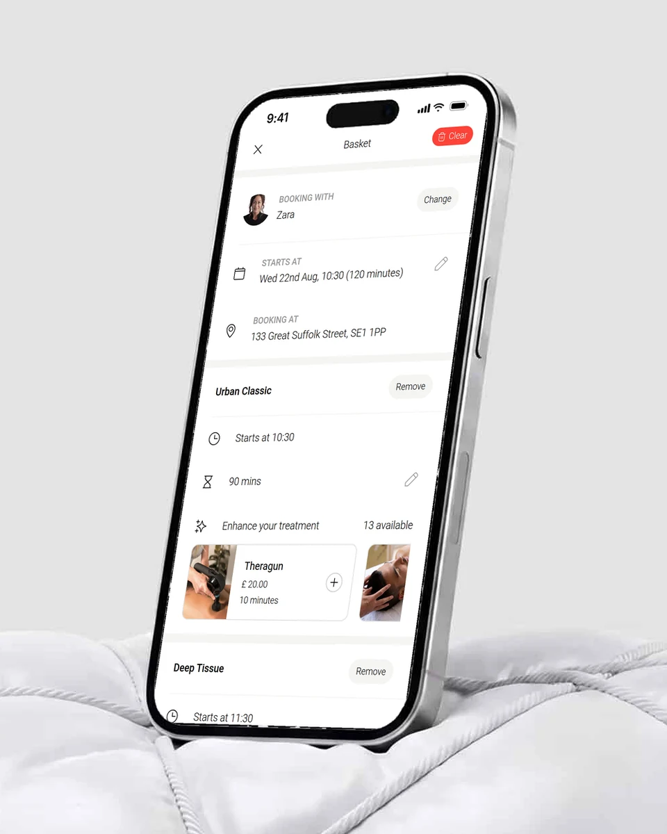
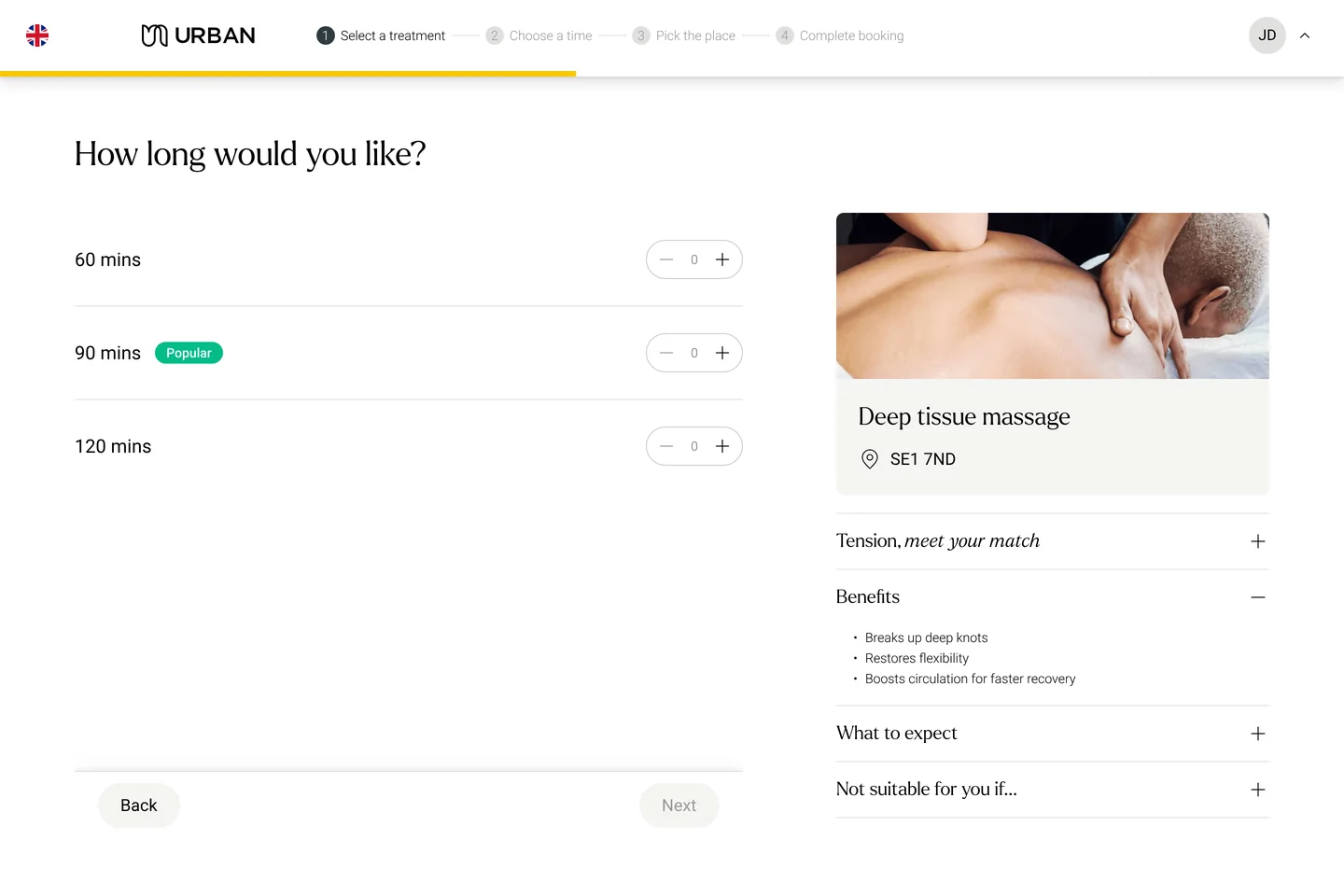
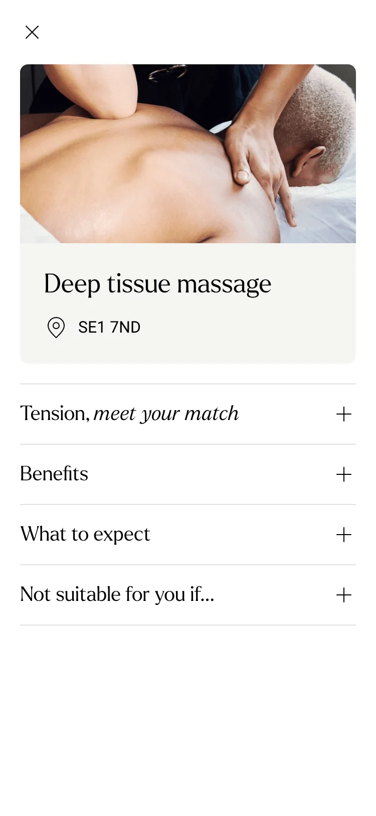
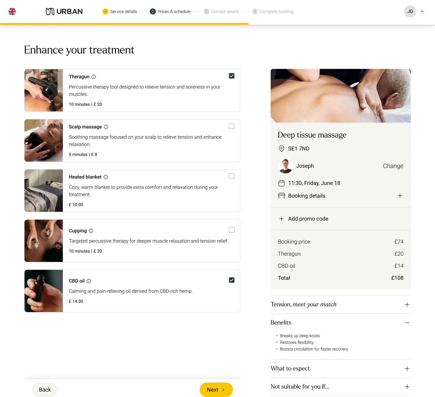
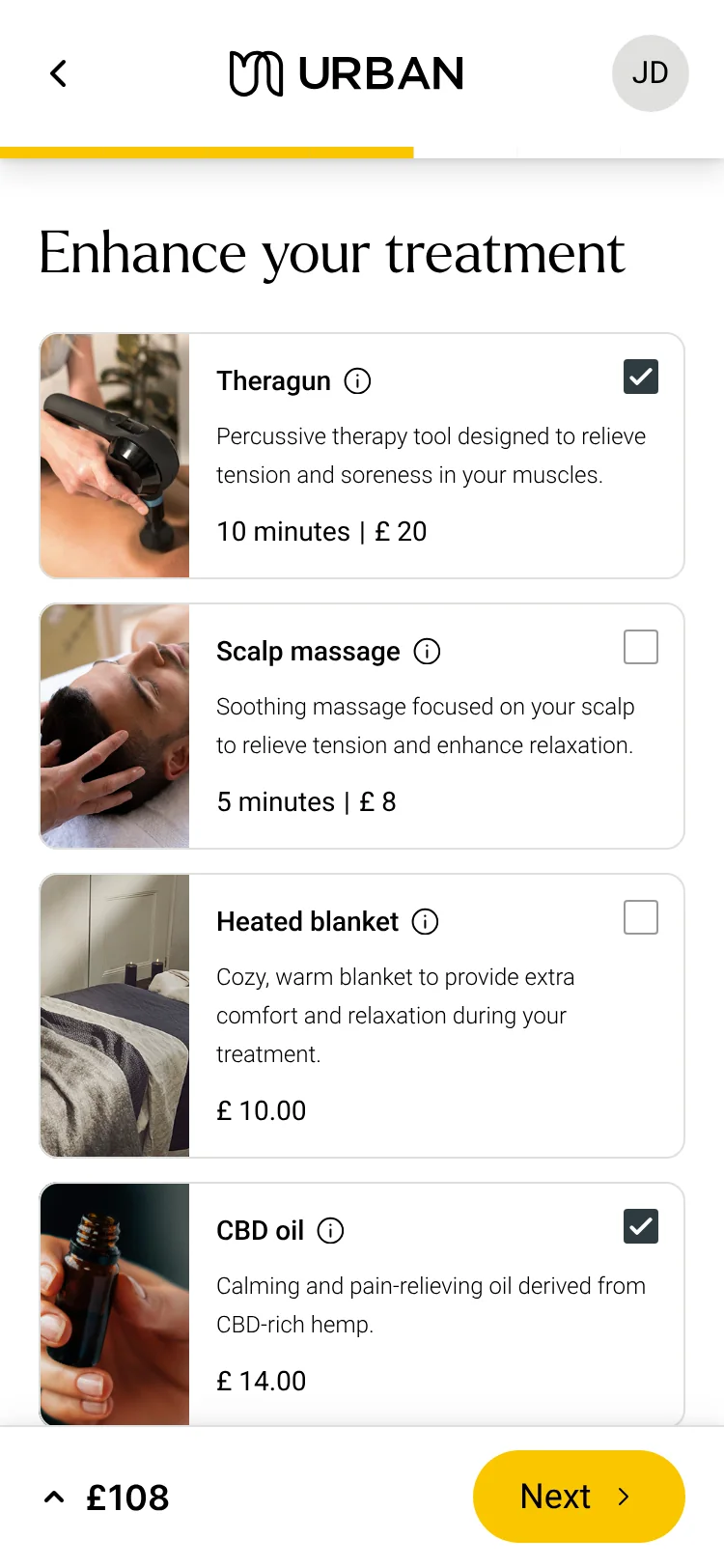
The old basket hid the new feature
Dropping the add-on component into the old basket exposed a usability issue: the page was visually heavy, add-ons landed below the fold, and they looked detached from the treatment they belonged to.
A sticky checkout button, designed to speed up conversion, worked almost too well. Customers saw it and paid without ever discovering add-ons.
From the original basket to the new one
Research · Maze test
Hidden, not ignored
Only 4 of 20 participants found add-ons in the old basket; after the redesign, all 20 did. The full Maze log, task by task.
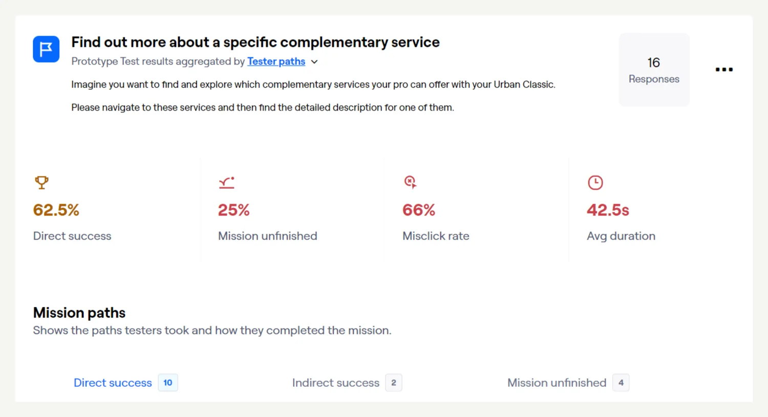
Finding add-ons took real effort
Asked to find details of a complementary service, 10 of 16 testers succeeded directly. Two-thirds of clicks missed, and the task took 42.5 seconds on average.
62.5% direct success · 66% misclick
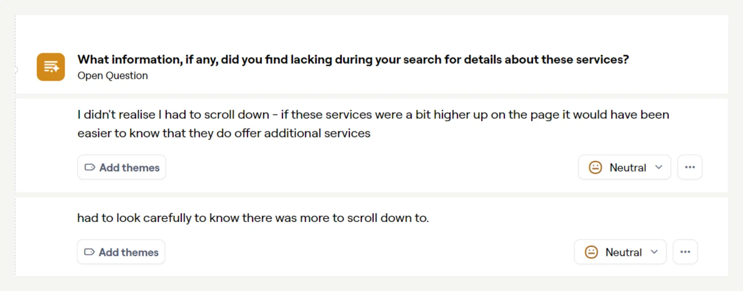
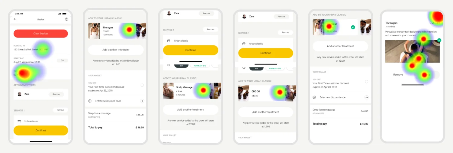
Testers didn’t know there was more to scroll to
“I didn’t realise I had to scroll down.” The sticky checkout button let people continue without ever reaching add-ons. The proposed fix: declutter the basket so add-ons sit in the first viewport.
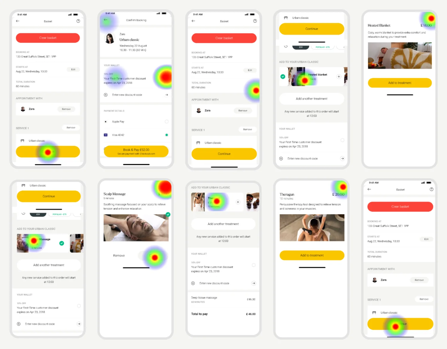
Checkout first, add-ons never
This tester’s first move was the sticky button, not scrolling. They got stuck, went back to the basket, and only then found the add-ons.
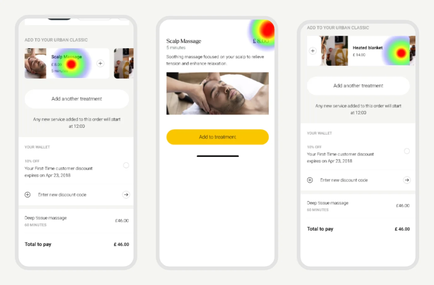
Heatmap 1 of 3
Everything but the add-ons
Probably unsure of the task, this tester tapped duration and location first, then selected several add-ons before opening one.
Heatmap 2 of 3
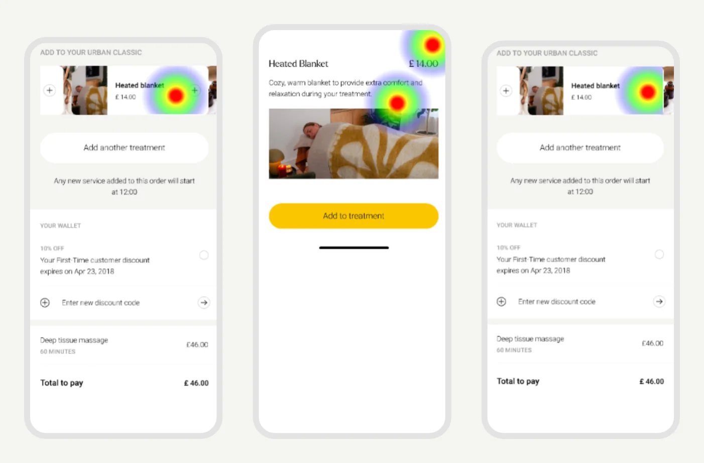
A path nobody planned for
Like the others, this tester selected an item before opening it to learn more, a path Maze didn’t count as success.
Heatmap 3 of 3
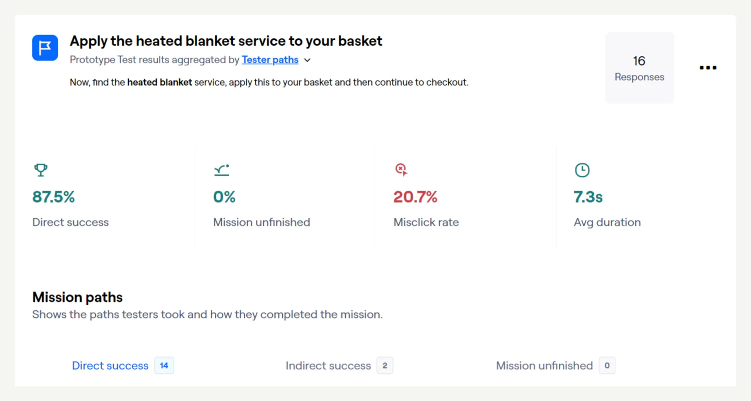
Adding was easy once add-ons were visible
Asked to apply the heated blanket, 14 of 16 testers did it directly, in about seven seconds.
87.5% direct success · 7.3s
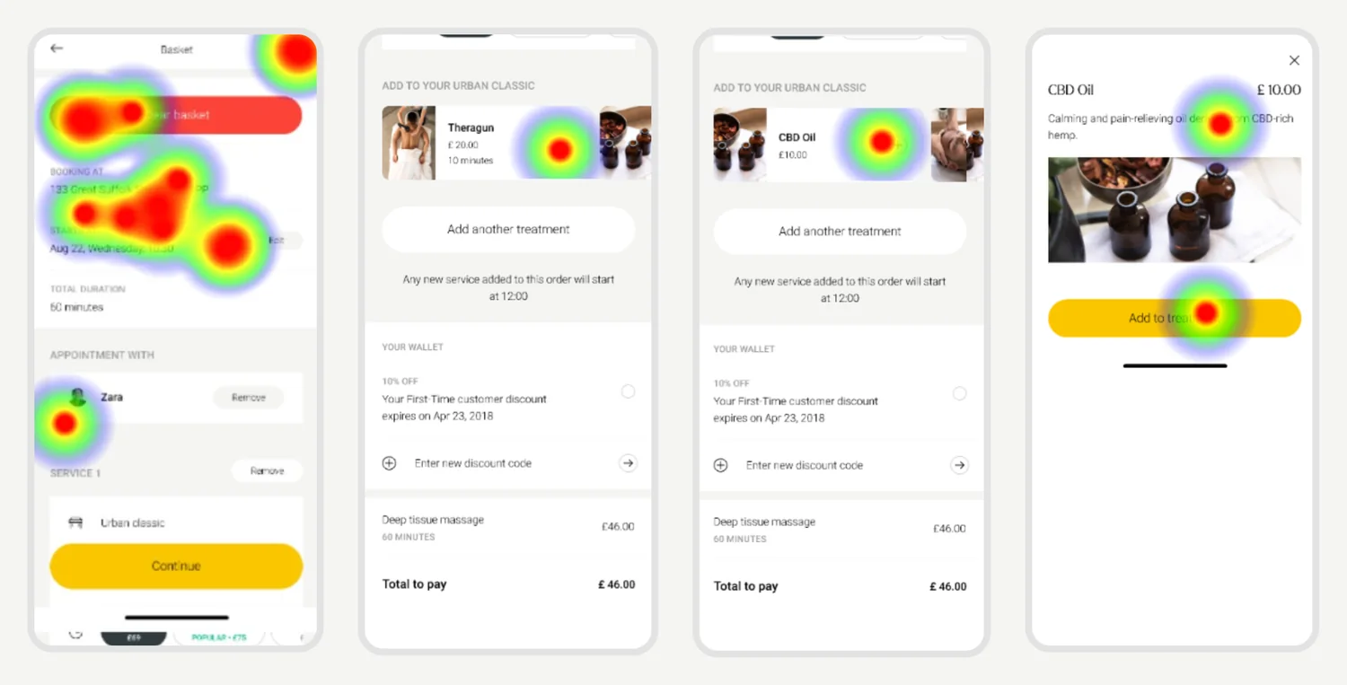
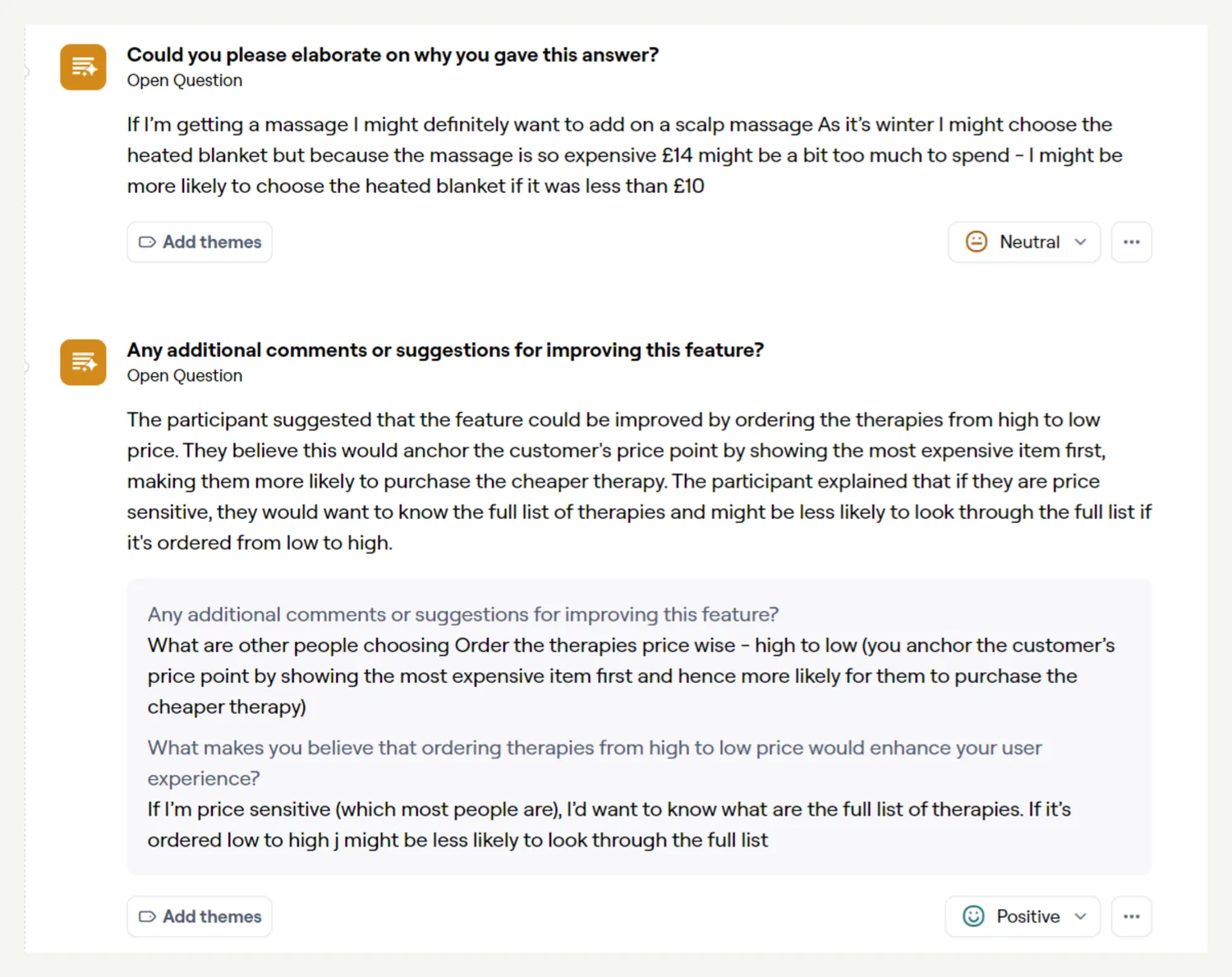
Price shaped the choice
One tester would rather add a scalp massage than a heated blanket on price. Another suggested ordering add-ons from high to low to anchor price expectations.
Personal preference, not confusion
Interest in a scalp massage led this tester off the direct path and into an indirect success.
Heatmap 1 of 2
A likely misclick
The tester probably tapped the card instead of the add button, closed the modal, then added the heated blanket.
Heatmap 2 of 2
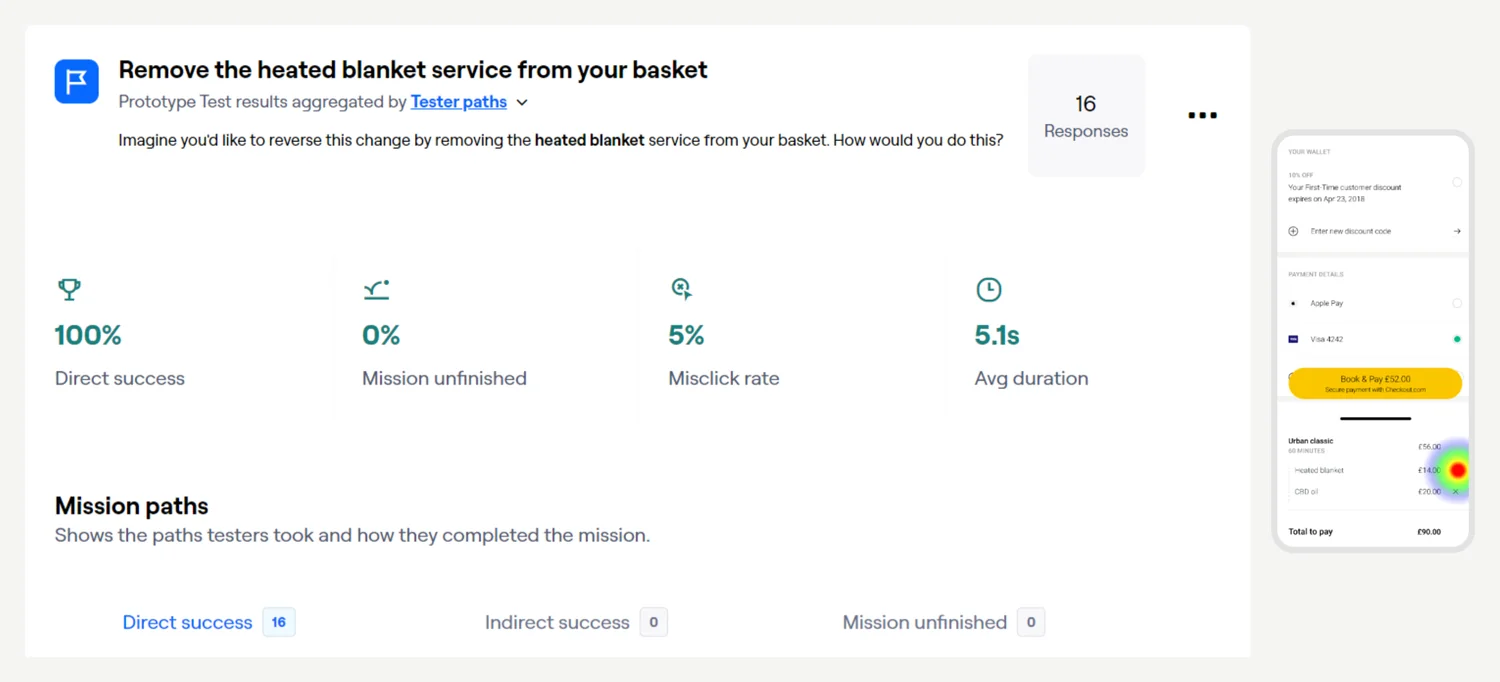
Removing was unambiguous
Every tester removed the heated blanket directly, and only one of 16 did it from the checkout page.
100% direct success · 5% misclick
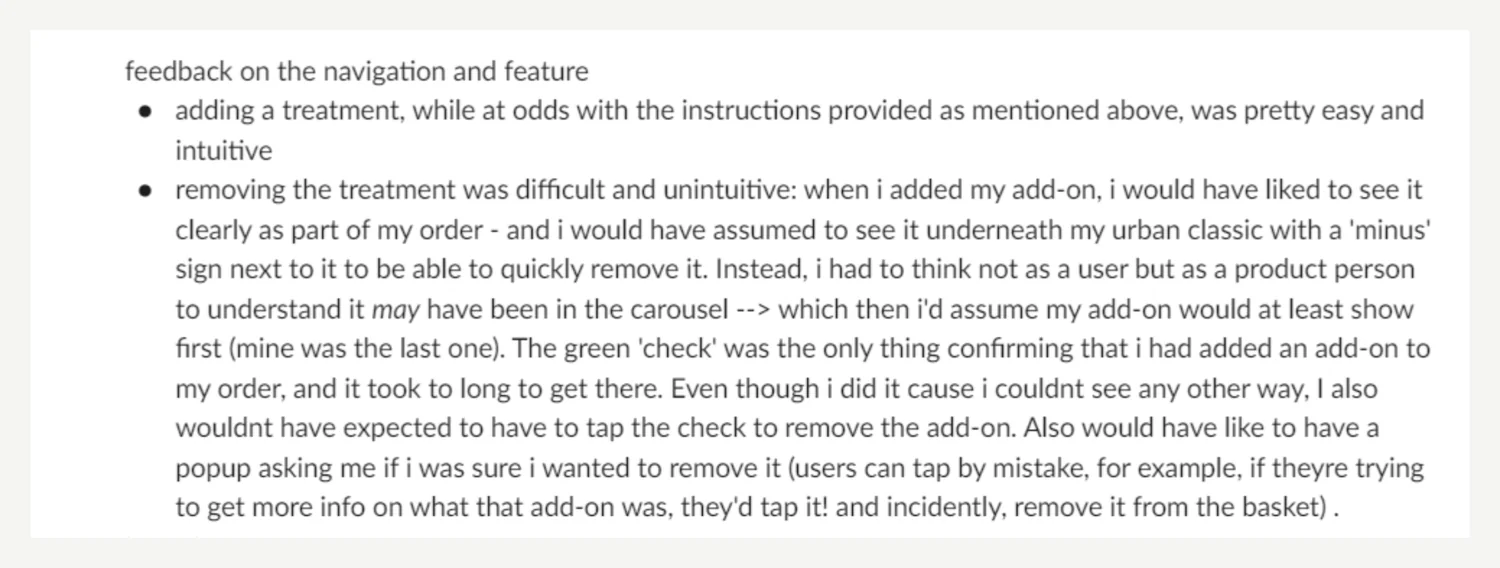
Removing should feel as easy as adding
Testers found adding easy but removing less intuitive, and asked for a confirmation when removing an add-on from the carousel.
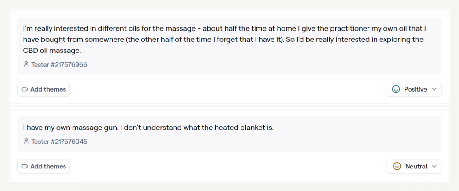
Customers with their own products
An open question for the business: customers who bring their own oils or massage gun.
01Task 1 · Find an add-on
Finding add-ons took real effort
Asked to find details of a complementary service, 10 of 16 testers succeeded directly. Two-thirds of clicks missed, and the task took 42.5 seconds on average.
62.5% direct success · 66% misclick
01Task 1 · Find an add-on
Testers didn’t know there was more to scroll to
“I didn’t realise I had to scroll down.” The sticky checkout button let people continue without ever reaching add-ons. The proposed fix: declutter the basket so add-ons sit in the first viewport.
01Task 1 · Find an add-on
Checkout first, add-ons never
This tester’s first move was the sticky button, not scrolling. They got stuck, went back to the basket, and only then found the add-ons.
Heatmap 1 of 3
01Task 1 · Find an add-on
Everything but the add-ons
Probably unsure of the task, this tester tapped duration and location first, then selected several add-ons before opening one.
Heatmap 2 of 3
01Task 1 · Find an add-on
A path nobody planned for
Like the others, this tester selected an item before opening it to learn more, a path Maze didn’t count as success.
Heatmap 3 of 3
02Task 2 · Apply an add-on
Adding was easy once add-ons were visible
Asked to apply the heated blanket, 14 of 16 testers did it directly, in about seven seconds.
87.5% direct success · 7.3s
02Task 2 · Apply an add-on
Price shaped the choice
One tester would rather add a scalp massage than a heated blanket on price. Another suggested ordering add-ons from high to low to anchor price expectations.
02Task 2 · Apply an add-on
Personal preference, not confusion
Interest in a scalp massage led this tester off the direct path and into an indirect success.
Heatmap 1 of 2
02Task 2 · Apply an add-on
A likely misclick
The tester probably tapped the card instead of the add button, closed the modal, then added the heated blanket.
Heatmap 2 of 2
03Task 3 · Remove an add-on
Removing was unambiguous
Every tester removed the heated blanket directly, and only one of 16 did it from the checkout page.
100% direct success · 5% misclick
04Feedback & questions
Removing should feel as easy as adding
Testers found adding easy but removing less intuitive, and asked for a confirmation when removing an add-on from the carousel.
04Feedback & questions
Customers with their own products
An open question for the business: customers who bring their own oils or massage gun.
Redesigning the basket
Easier to understand, navigate and act on
What started as a feature became a basket redesign. The goal wasn’t just a cleaner page: it was to surface add-ons without slowing anyone down.
Reduce unnecessary visual density
Improve information hierarchy
Make booking details easy to scan
Lower the effort to understand the page
Show add-ons within the first viewport
Keep the fast path to checkout
Before and after
After launch
Five weeks in numbers
Weekly notes from the post-launch report, with the charts we tracked in Looker.
Early traction, limited by eligibility
Week 1 converted around 10% of impressions. By week 2, add-on sales were up 35% and about 8% of customers shown add-ons bought one. But only around 28% of baskets were eligible, so supply became the lever.
+35% week on week
Most practitioners now offered add-ons
The backend team added add-ons to every eligible practitioner who hadn’t opted out. 59% of pros with hours now offered them, up from 20%, and 69% of pros active in the last 28 days had add-ons.
20% → 59% of pros offering add-ons
More customers saw add-ons at checkout
Daily sessions show the share of checkout entrants shown an add-on climbing sharply once supply increased, reaching 52% in the week of 15 July.
52% of checkout entrants saw add-ons
The first month in revenue
A month after launch, 294 add-ons had been sold, adding £3,316 in gross transaction value and £1,015 in fees retained by Urban.
294 sold · £3,316 GTV · £1,015 fees
Sales more than doubled in a week
126 add-ons sold in a single week, up 110%, and more than the previous two weeks combined.
+110% week on week
Add-on sales, week on week
Week 1
+35%Week 2
Add-ons sold (indexed to week 1)
Baskets eligible for add-ons
~28%
Eligible Not eligible
Conversion
~10%of impressions · week 1
~8%of customers shown add-ons · week 2
1 in 12.5potential orders sold an add-on
Supply
20% → 24%of working pros offering at least one add-on
01Weeks 1–2
Early traction, limited by eligibility
Week 1 converted around 10% of impressions. By week 2, add-on sales were up 35% and about 8% of customers shown add-ons bought one. But only around 28% of baskets were eligible, so supply became the lever.
+35% week on week
Add-on sales, week on week
Week 1
+35%Week 2
Add-ons sold (indexed to week 1)
Baskets eligible for add-ons
~28%
Eligible Not eligible
Conversion
~10%of impressions · week 1
~8%of customers shown add-ons · week 2
1 in 12.5potential orders sold an add-on
Supply
20% → 24%of working pros offering at least one add-on
02Week 3
Most practitioners now offered add-ons
The backend team added add-ons to every eligible practitioner who hadn’t opted out. 59% of pros with hours now offered them, up from 20%, and 69% of pros active in the last 28 days had add-ons.
20% → 59% of pros offering add-ons
02Week 3
More customers saw add-ons at checkout
Daily sessions show the share of checkout entrants shown an add-on climbing sharply once supply increased, reaching 52% in the week of 15 July.
52% of checkout entrants saw add-ons
03Week 4
The first month in revenue
A month after launch, 294 add-ons had been sold, adding £3,316 in gross transaction value and £1,015 in fees retained by Urban.
294 sold · £3,316 GTV · £1,015 fees
04Week 5
Sales more than doubled in a week
126 add-ons sold in a single week, up 110%, and more than the previous two weeks combined.
+110% week on week
03
Request to Book
Removing the back-and-forth between customers and practitioners
Urban relied on practitioners committing availability in advance. A customer’s favourite practitioner could be free, and still not appear in search.
The existing workaround involved several steps:
1Customer messages practitioner
2Practitioner updates availability
3Practitioner messages customer
4Customer returns to search
5Customer finds practitioner
6Customer completes booking
This created unnecessary back-and-forth. If either person responded slowly, the booking opportunity could disappear altogether, as requests like these tend to be last minute bookings. The result was friction for the customer, lost bookings for practitioners, and missed revenue opportunities for Urban.
9:41
Giorgiana
Today
10:04W
Hi Giorgiana, could you fit me in for a deep tissue massage at 12 today? I can’t find you in search.
41 min later
10:45
So sorry, only just seen this! I’ve added 12:00 to my availability. Can you check you can see me now?
52 min later
11:37W
Sorry, just got back to this. I’ve searched again and still can’t find you for 12:00.
11:41
Ah, that’s likely travel time. I’m a bit far from your location right now, so I don’t show up for your address.
Type your message
GiorgianaCustomer’s search · Fri · Deep tissue
10:00
11:00
12:00
13:00
Not committed, so not in searchAdded to her availabilityStill hidden: 48 min travel away
Waiting on Giorgiana
0 min
0 of 6 hand-offs
1h 37m · Booking lost
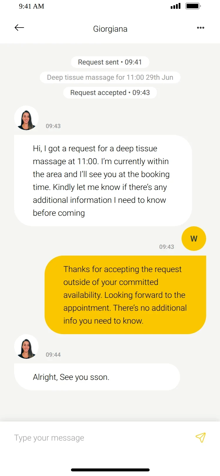
Let customers request a time the practitioner hasn’t committed, while the practitioner keeps control of whether they can do it.
Designing around uncertainty
A request is not a booking
Instant slots were confirmed bookings, because the practitioner had already committed the time. A request wasn’t, so the existing pay-to-book model didn’t translate. I designed Request to Book as a new booking state across the system, answering what the customer needs at every step: has it been sent, is the practitioner reviewing it, has it been accepted, declined or expired, when does payment happen, and what can they do while waiting.
04
The Urban product redesign
Rebuilding the customer and practitioner experience on a new platform
After several optimisation projects and new features, I was asked to lead design for a full product redesign, in about three months.
It ran alongside a major technical migration from Urban’s legacy system to ServiceOS, a third-party platform-as-a-service. This wasn’t a greenfield project. The internal Manage X platform was out of scope.
~3
months
Redesign timeline
4
surfaces
Pro app, Customer app, Customer web app and responsive web
1
platform migration
From Urban’s legacy system to ServiceOS
Designing within platform constraints
From Zeplin images to a working Figma foundation
ServiceOS had an established component framework for booking platforms, but no Figma design system. Its documentation lived in Zeplin, mostly as component images.
I translated the platform into a usable design foundation, and identified where Urban’s experience needed custom components or patterns. ServiceOS was open to new components, but every deviation added implementation work and migration risk.
Does this improve the experience enough to justify the implementation cost and migration complexity?
The booking flow challenge
Two ways in, on a platform built for one
UrbanTwo ways in, one booking
By availability
By practitioner
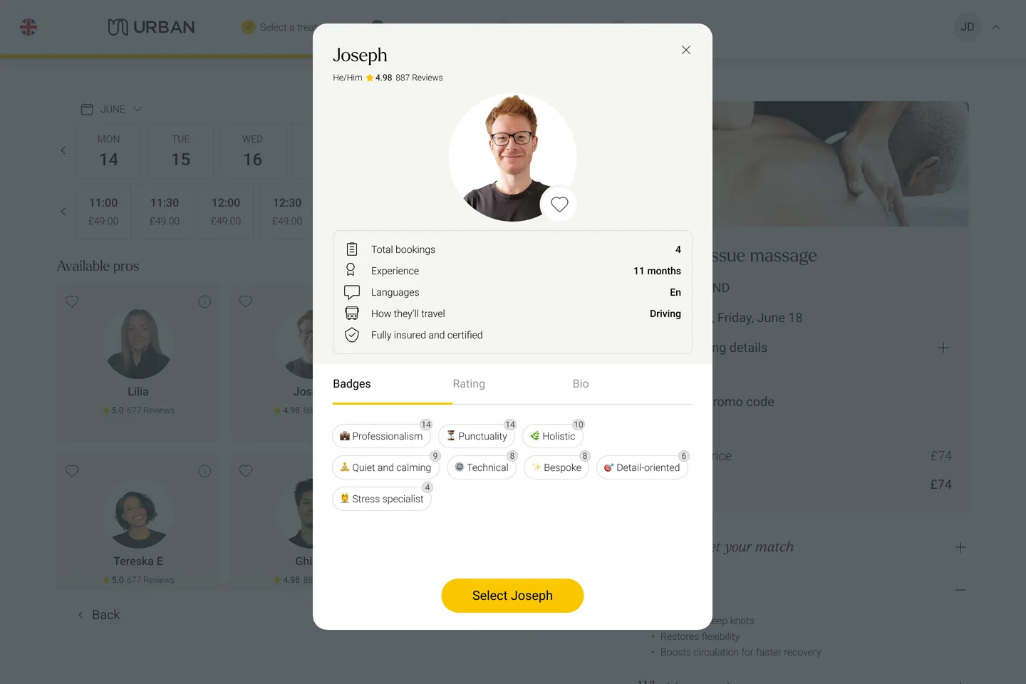
ServiceOSOne line, one attribute per screen
Fixed sequence
No entry by practitioner
The question wasn’t “how do we make Urban fit the new platform?” It was: which parts of the existing experience are essential, and how do we keep them within the platform’s constraints?
Search and availability had a direct line to booking conversion, so I didn’t settle it on stakeholder preference. I tested multiple versions in Maze, evaluating:
Usability
Comprehension
Navigation
Customer preference
Legacy vs platform trade-offs
The results told the team which parts of the legacy experience to preserve, adapt or redesign.
My role
Primary designer through the migration
I drove the customer and practitioner experience end to end: understanding the existing product, finding experience gaps, running research, defining interaction patterns, creating the new design system foundations, and shaping it all into something engineering could ship within the migration timeline.
That meant systems thinking across product, technology, operations and customer behaviour, not just screens.
The final product
A redesigned suite across mobile and web
Welcome
Value proposition
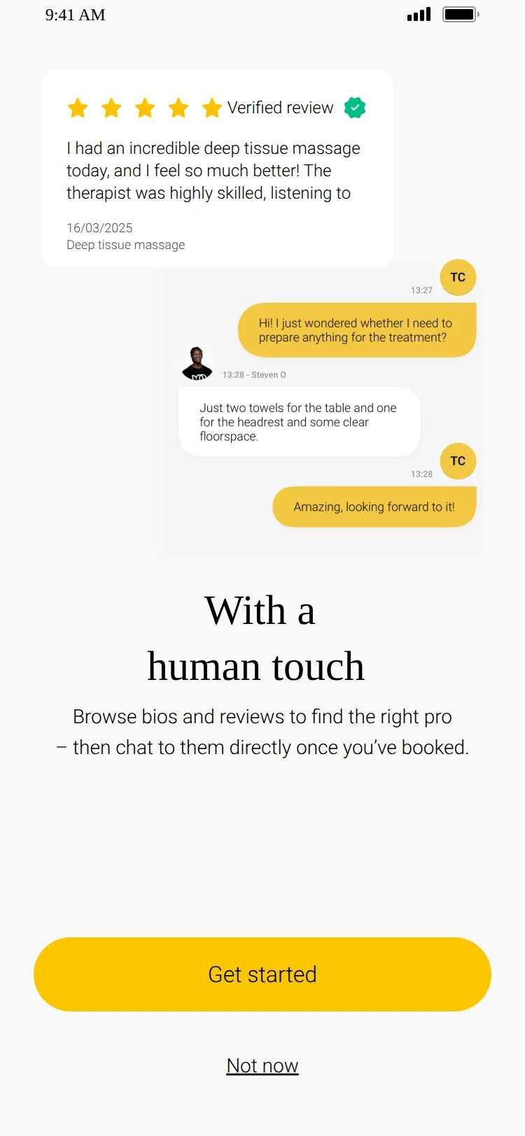
Human touch
Notifications
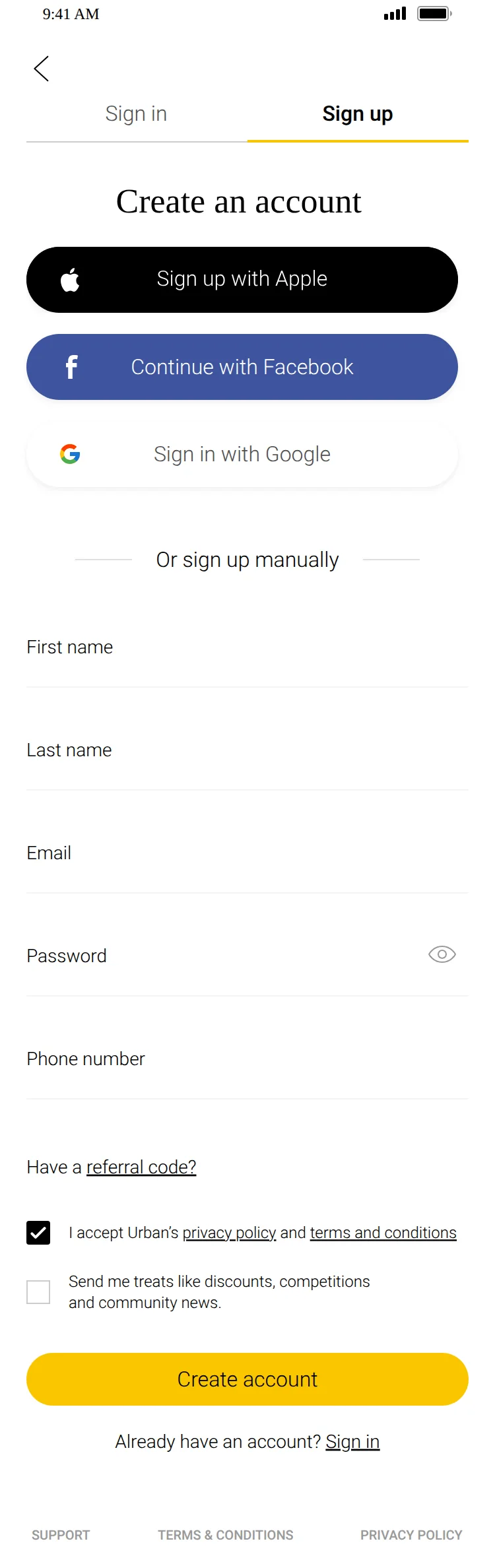
Sign up
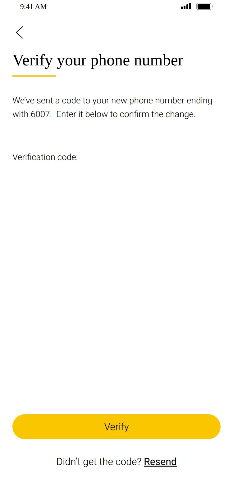
Verify phone
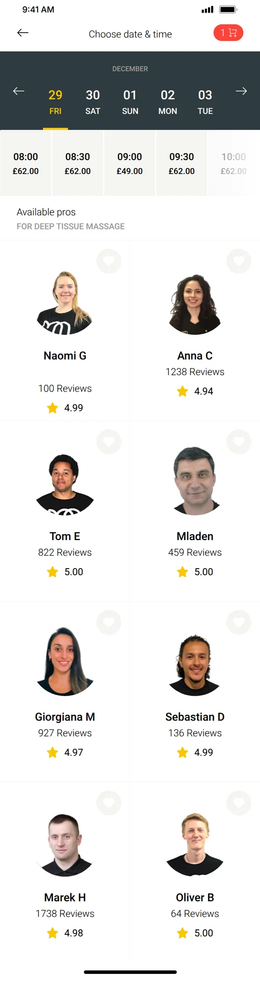
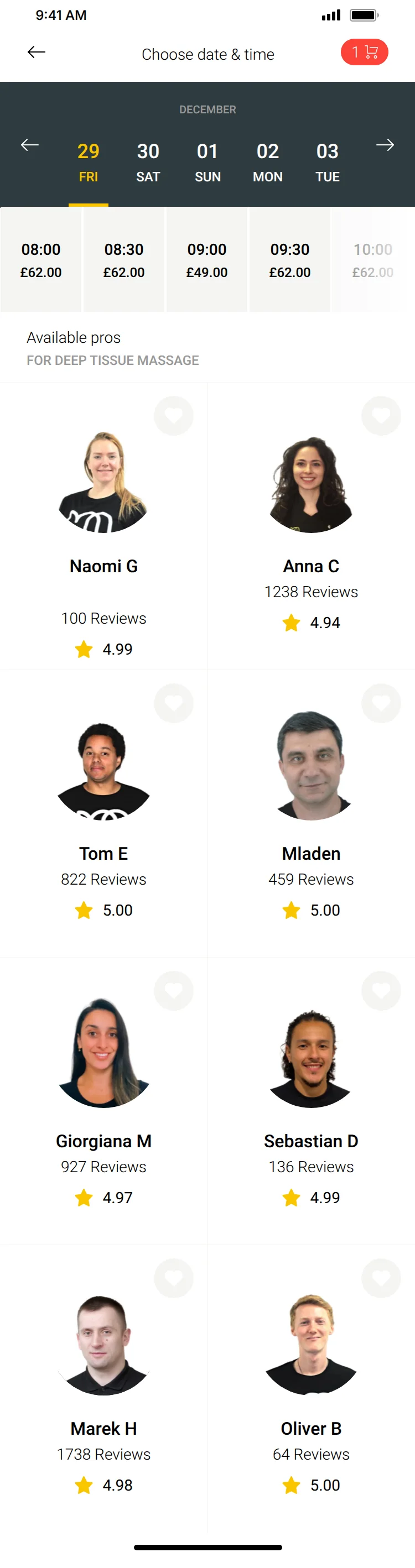
Search & availability
Practitioner profile
Instant & request slots
Add-ons
Basket
Checkout
Payment
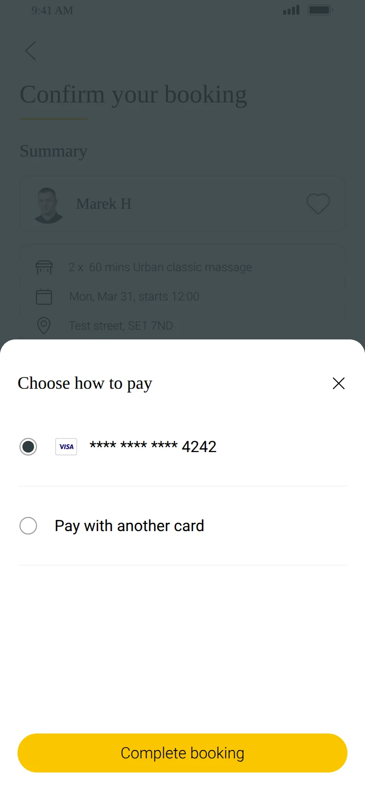
Address & parking
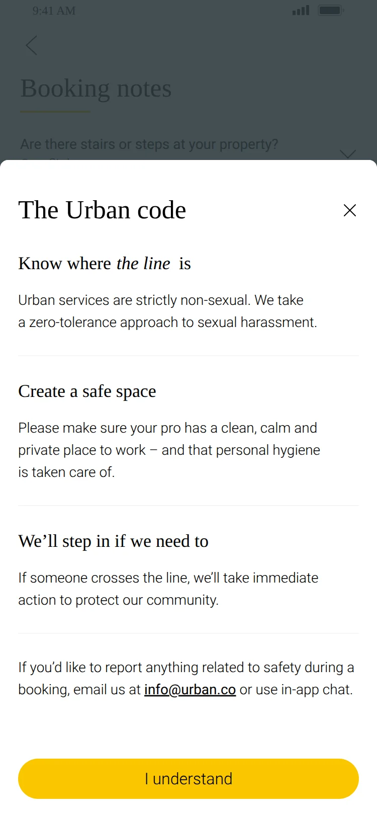
Code of conduct
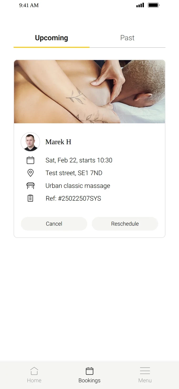
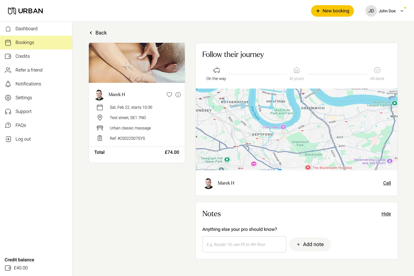
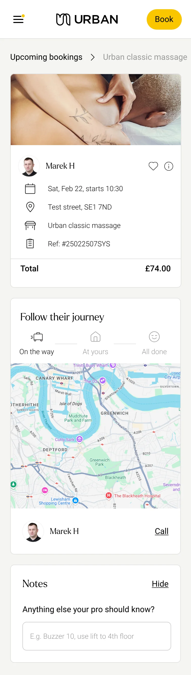
Upcoming
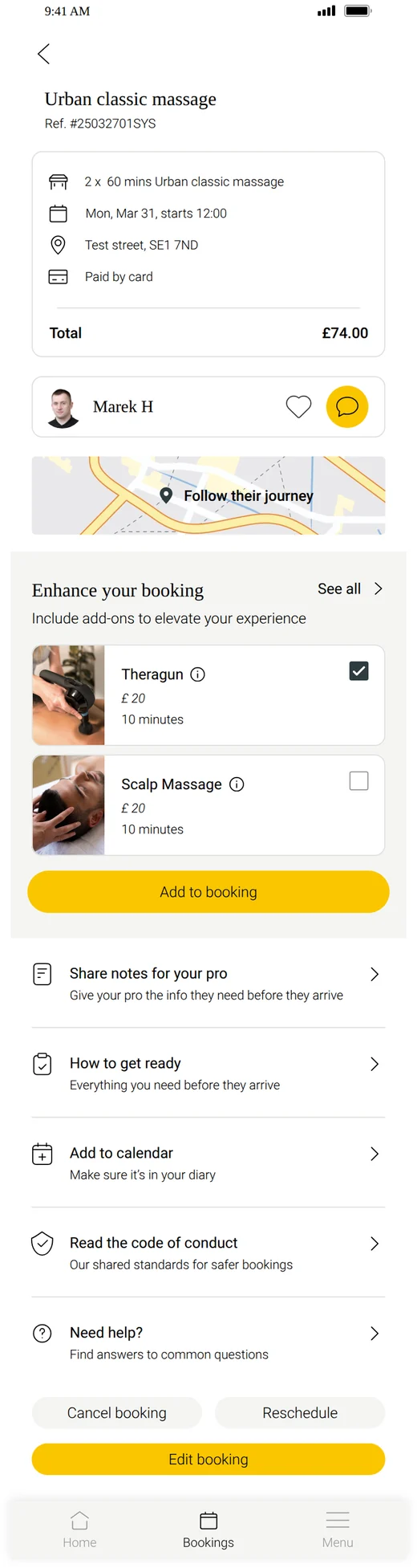
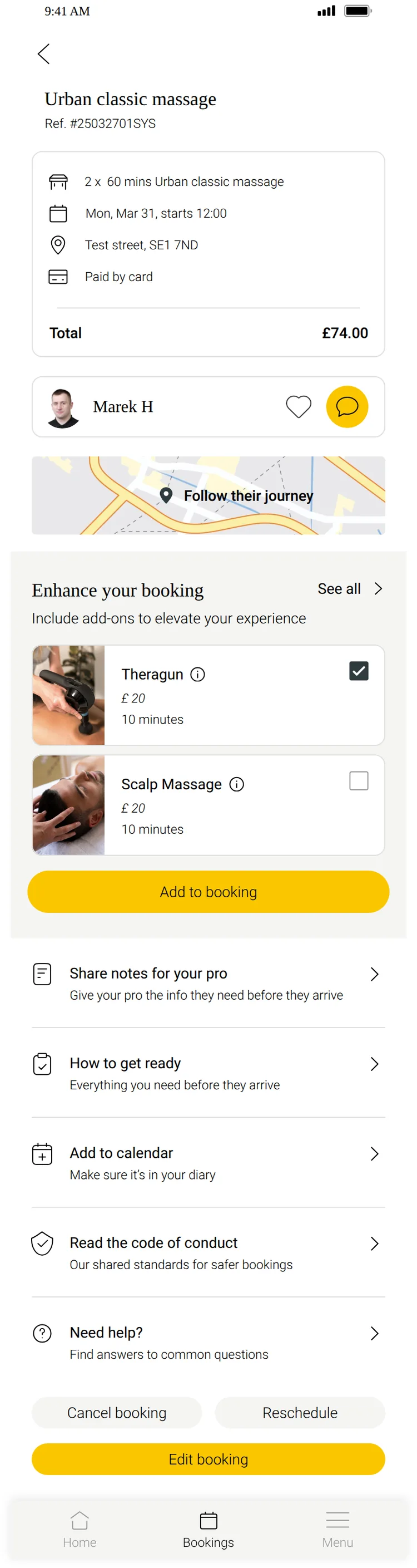
Booking details
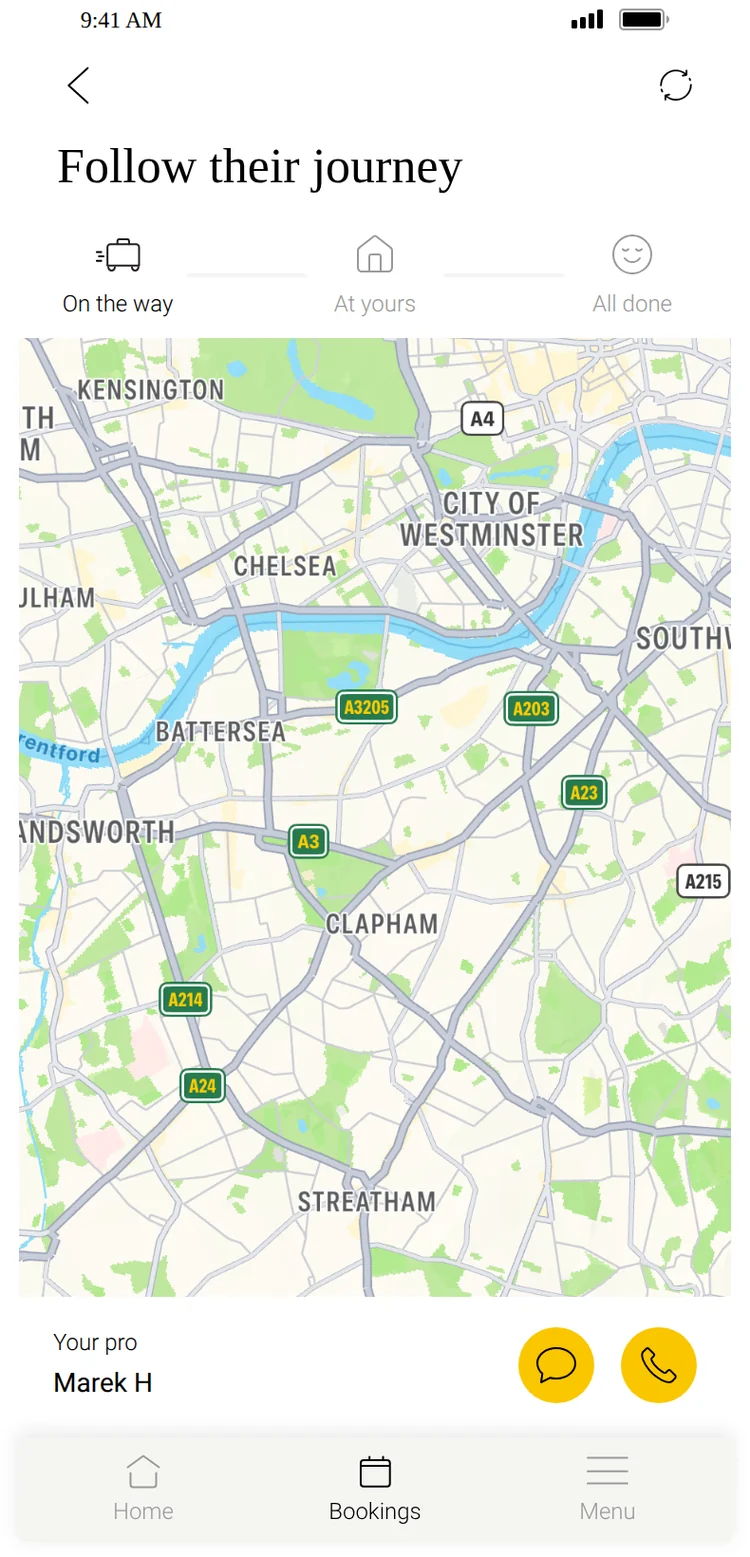
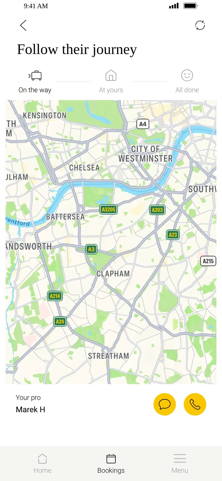
Practitioner tracker
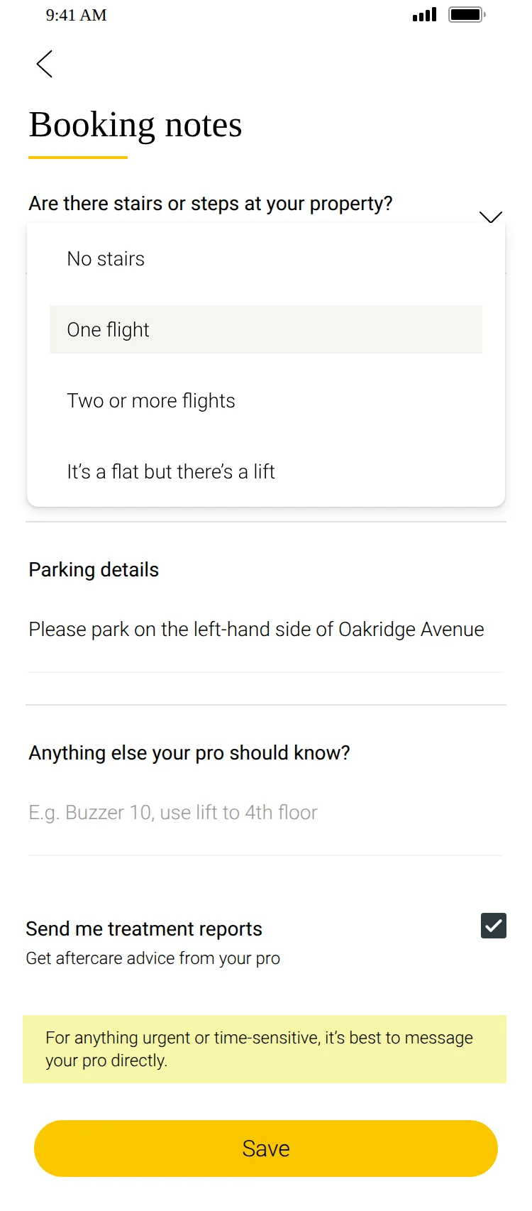
Booking notes
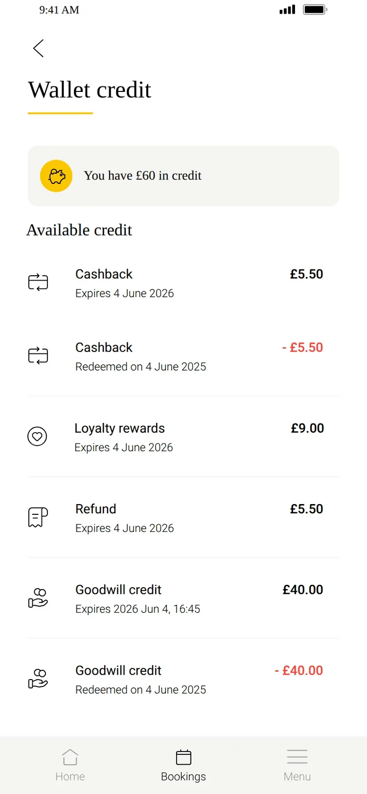
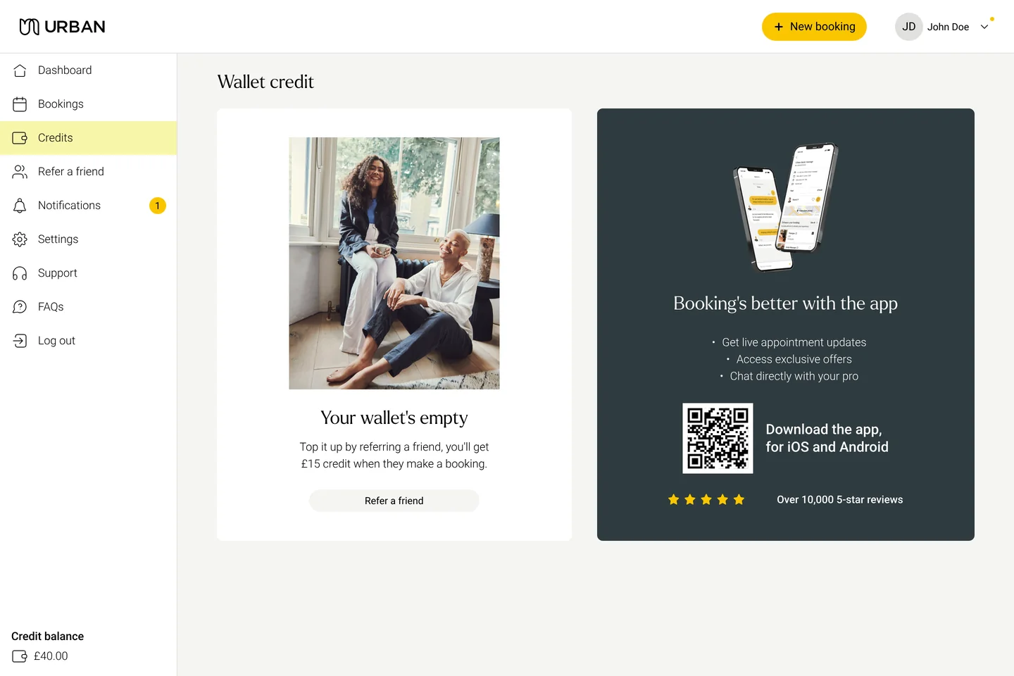
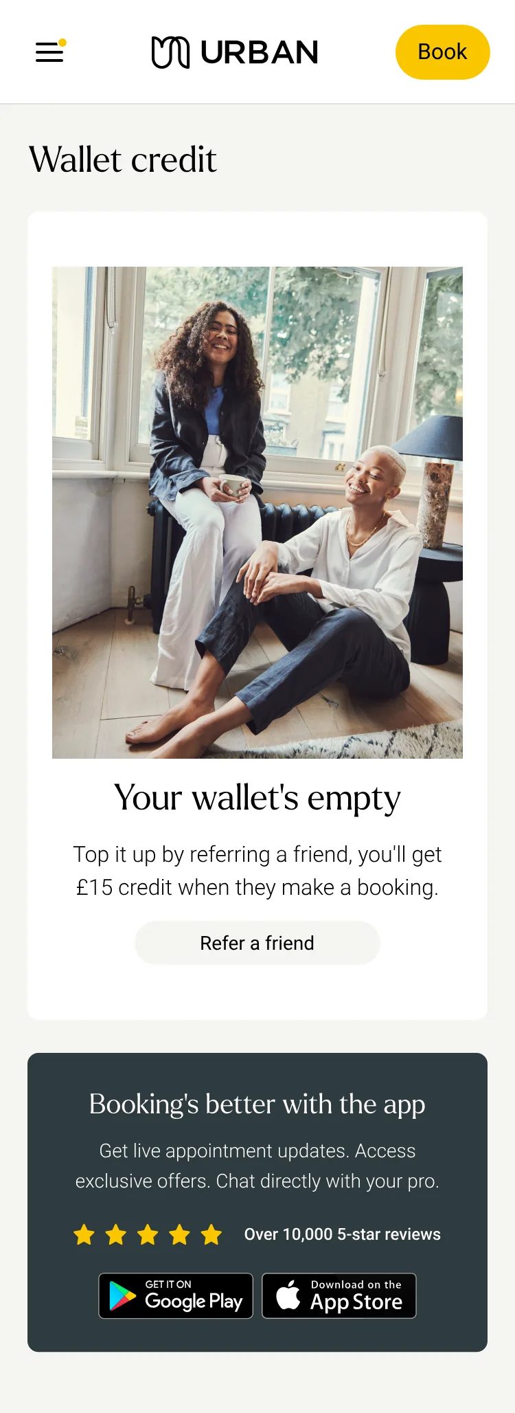
Vouchers & credits
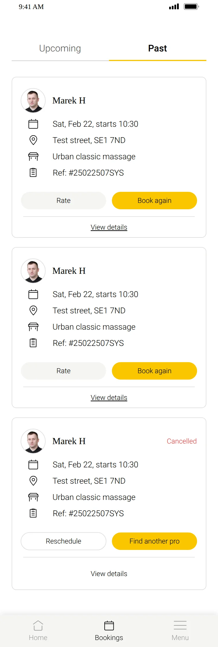
Historical bookings
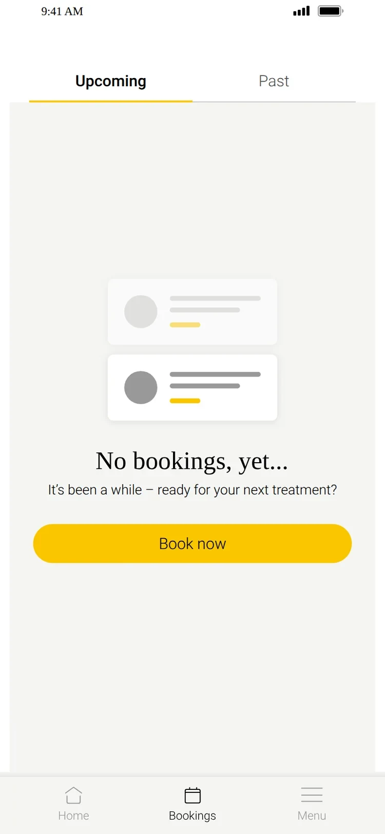
Empty state
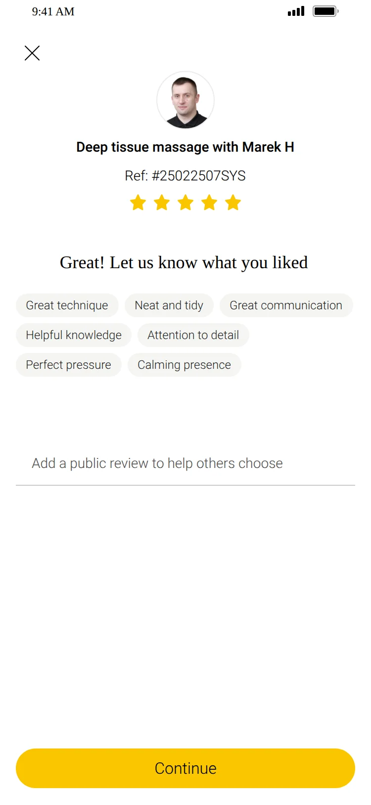
Ratings
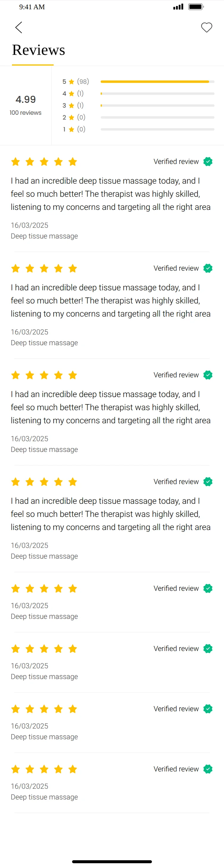
Reviews
Referrals
Instant messaging
Welcome
Value proposition
Human touch
Notifications
Sign up
Verify phone
Search & availability
Practitioner profile
Instant & request slots
Add-ons
Basket
Checkout
Payment
Address & parking
Code of conduct
Upcoming
Booking details
Practitioner tracker
Booking notes
Vouchers & credits
Historical bookings
Empty state
Ratings
Reviews
Referrals
Instant messaging
Home and search
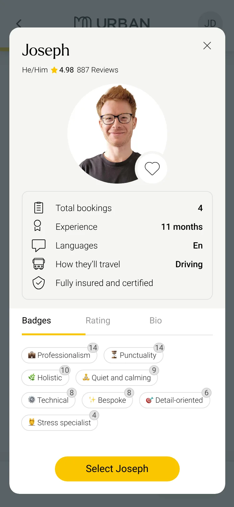
Practitioner profile
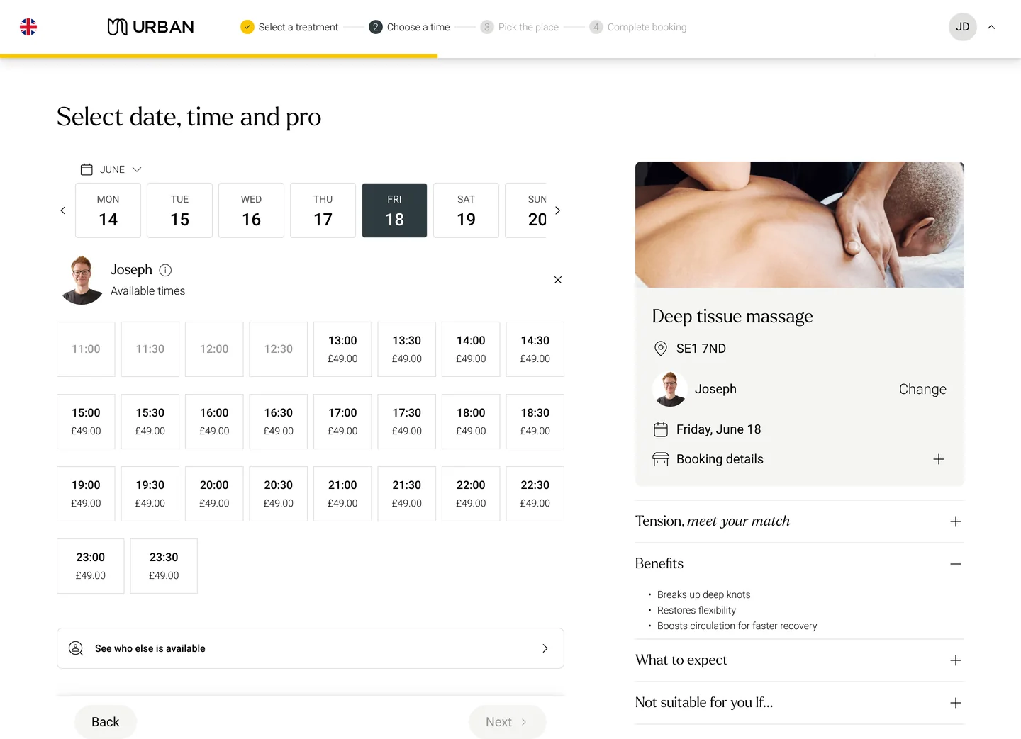
Date, time and practitioner
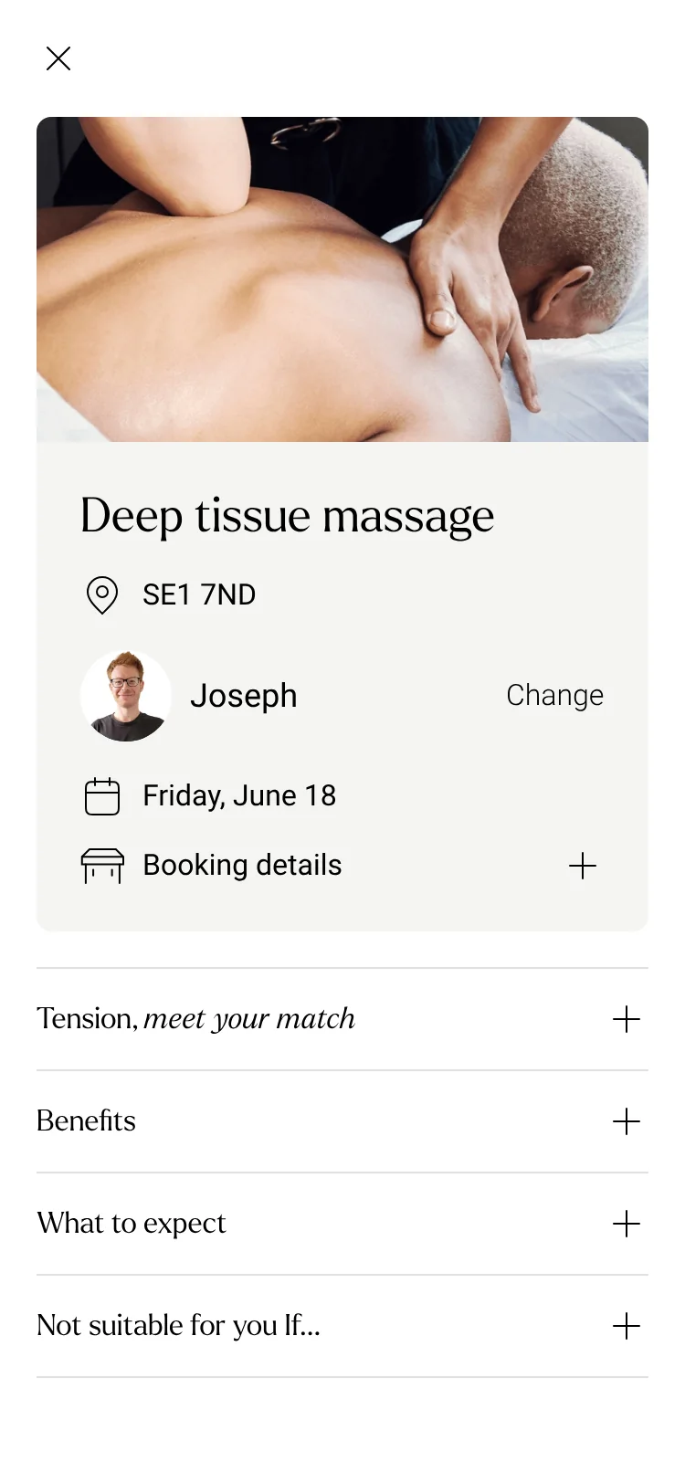
Treatment duration
Add-ons
Address and parking
Booking confirmed
Upcoming booking
Wallet credit
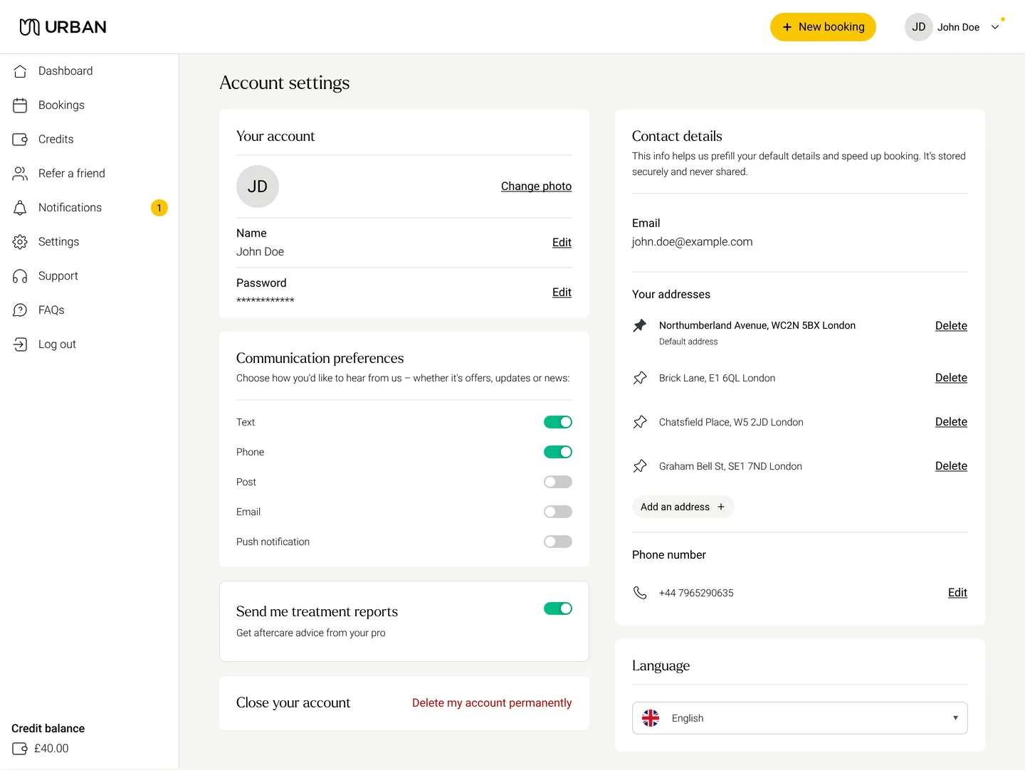
Account settings
Home and search
Practitioner profile
Date, time and practitioner
Treatment duration
Add-ons
Address and parking
Booking confirmed
Upcoming booking
Wallet credit
Account settings
Design system
One foundation, four products
Rather than a collection of UI components, I used the design system to keep products consistent while reducing design and implementation overhead: visual foundations, components, states, interaction patterns and layouts that scale across every surface.
A fully redesigned customer and practitioner product suite, delivered within the three-month design window.
A new foundation for Urban across mobile and web, built to work within the constraints of ServiceOS.
What this work taught me
Four lessons from a complex marketplace
01
UX problems are often system problems
Parking looked like a missing input. Add-ons looked like a new feature. Request to Book looked like a new booking option. Each was tied to systems, behaviours and business constraints that had to be understood before designing the interface.
02
Timing can matter as much as functionality
The parking input and the add-ons already existed. The challenge was getting them in front of customers at the right moment. Visibility, context and timing decide whether a useful feature succeeds.
03
Design decisions have commercial consequences
The booking flow wasn’t just a UX journey. It shaped availability, conversion, revenue, practitioner utilisation and retention, so decisions had to account for customer needs and business mechanics together.
04
Constraints can sharpen product thinking
Instead of working around the ServiceOS constraints, I used them to find which parts of the experience were truly valuable and which could be simplified. The work moved from redesigning screens to redesigning the product within a real-world system.
My work at Urban grew from solving individual UX problems to treating the product as a connected system. From one post-booking prompt to a full product redesign, the question stayed the same:
How do we make a complex marketplace feel simple for the people using it, while keeping it viable for the business and the systems behind it?