Case study · Practitioner app · Mobile
Giving practitioners control of their working day
How the Urban Pro app helps practitioners answer booking requests, manage their time and run every visit, from Request to Book through the move to a new platform.
Overview
Every customer booking starts on the practitioner’s side
What customers can book depends on what practitioners have set up: their hours, their service areas, and how quickly they answer.
Urban sends practitioners to customers’ homes for massage and other treatments. The Pro app is where practitioners plan availability, choose where they’ll travel, respond to requests, run each visit and get paid, often between appointments and on the move.
- Focus
- Practitioner (Pro) app
- Chapter 01
- Request to Book
- Chapter 02
- Pro App redesign
- Platform
- Urban legacy → ServiceOS
A practitioner’s day
- AvailabilityWhen they can work
- Service areasWhere they’ll travel
- RequestsAccept or decline
- TravelDirections and parking
- Check inStart the booking
- ExtendAdd time or extras
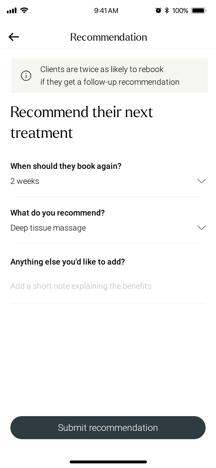
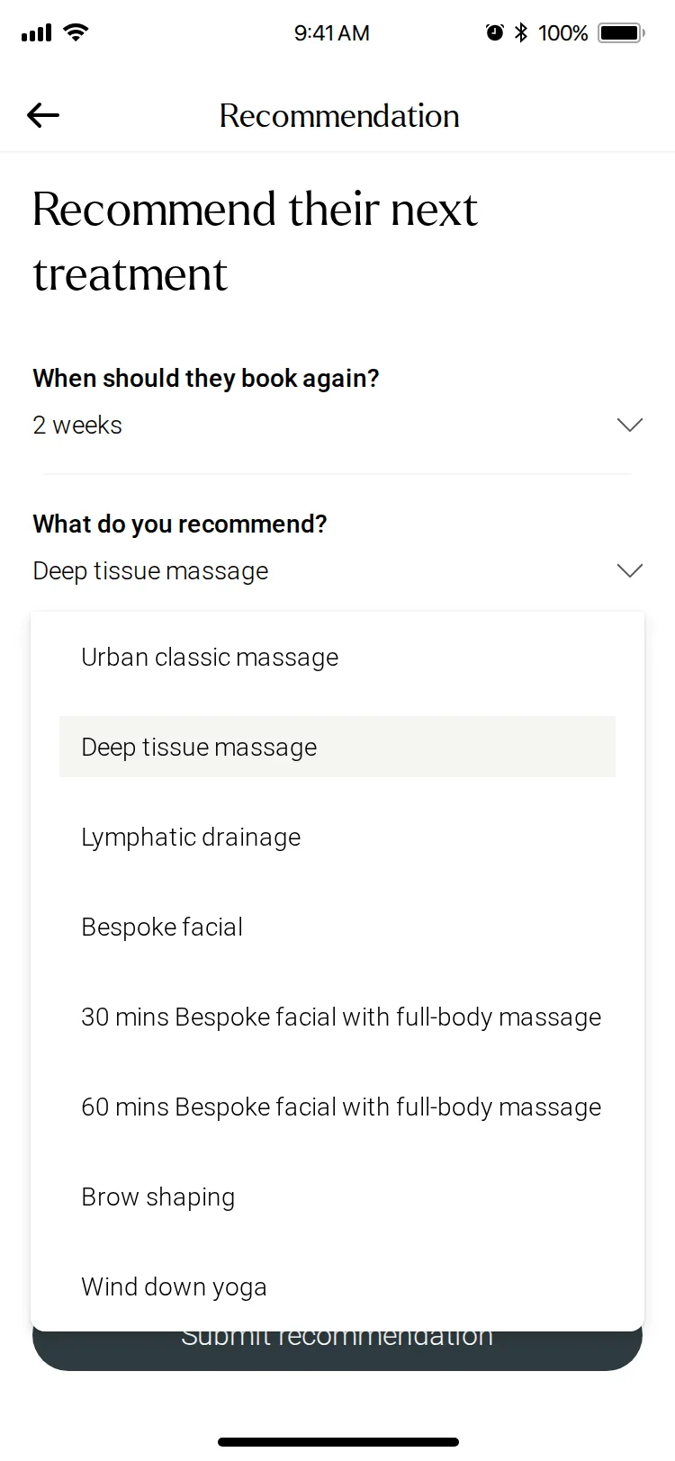
- RecommendSuggest a next treatment
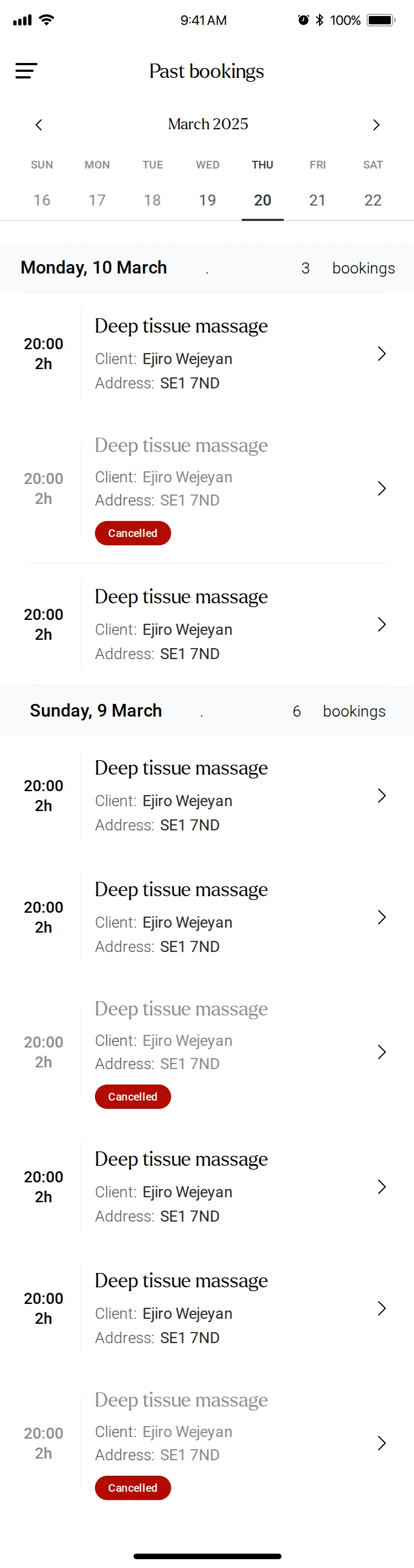
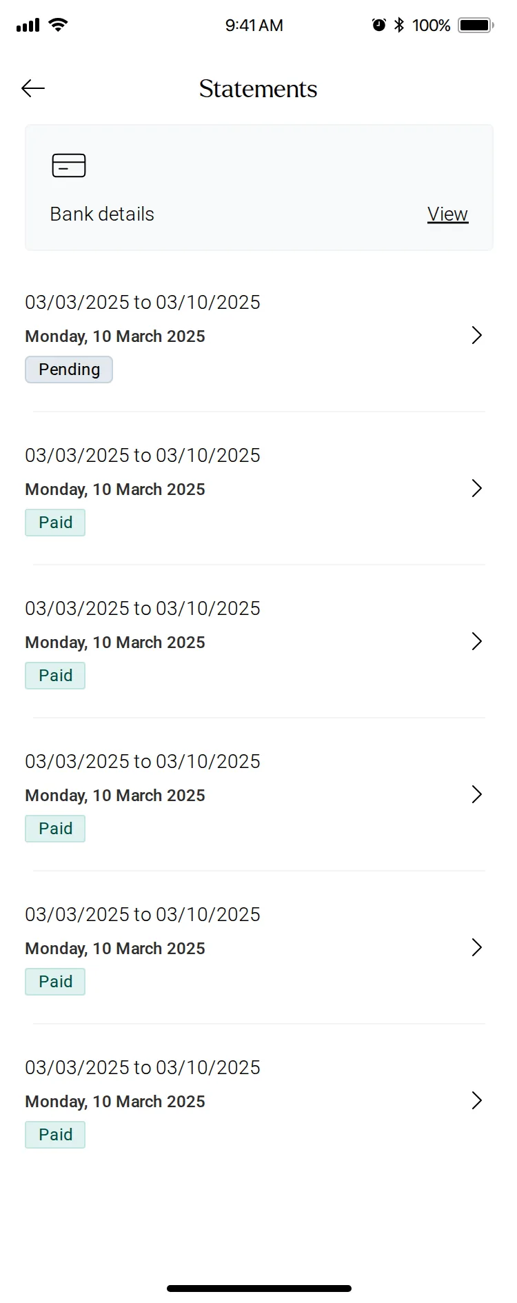
- Get paidStatements
Request to Book
Turning an hour the practitioner hadn’t committed into a booking they control
The customer promise
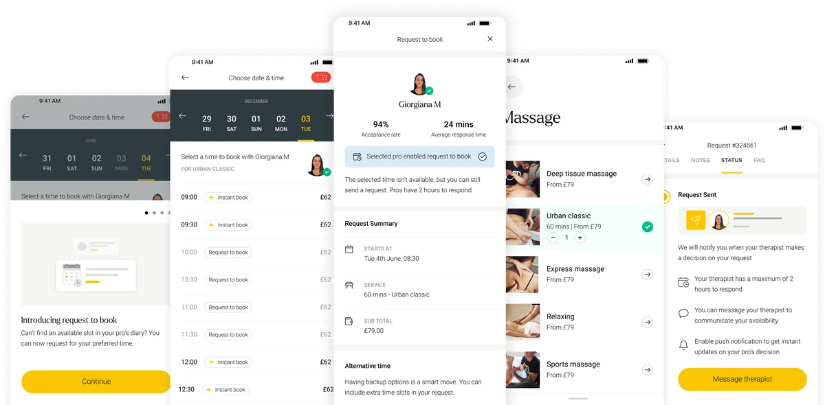
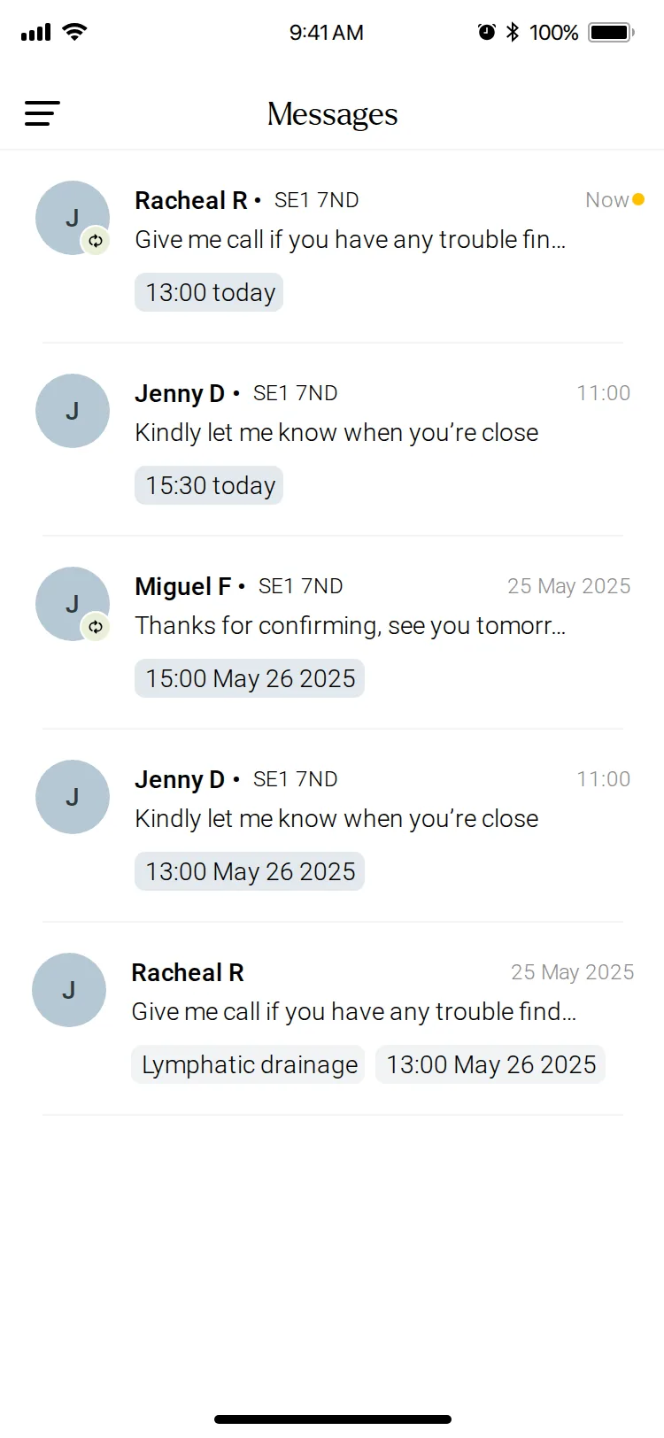
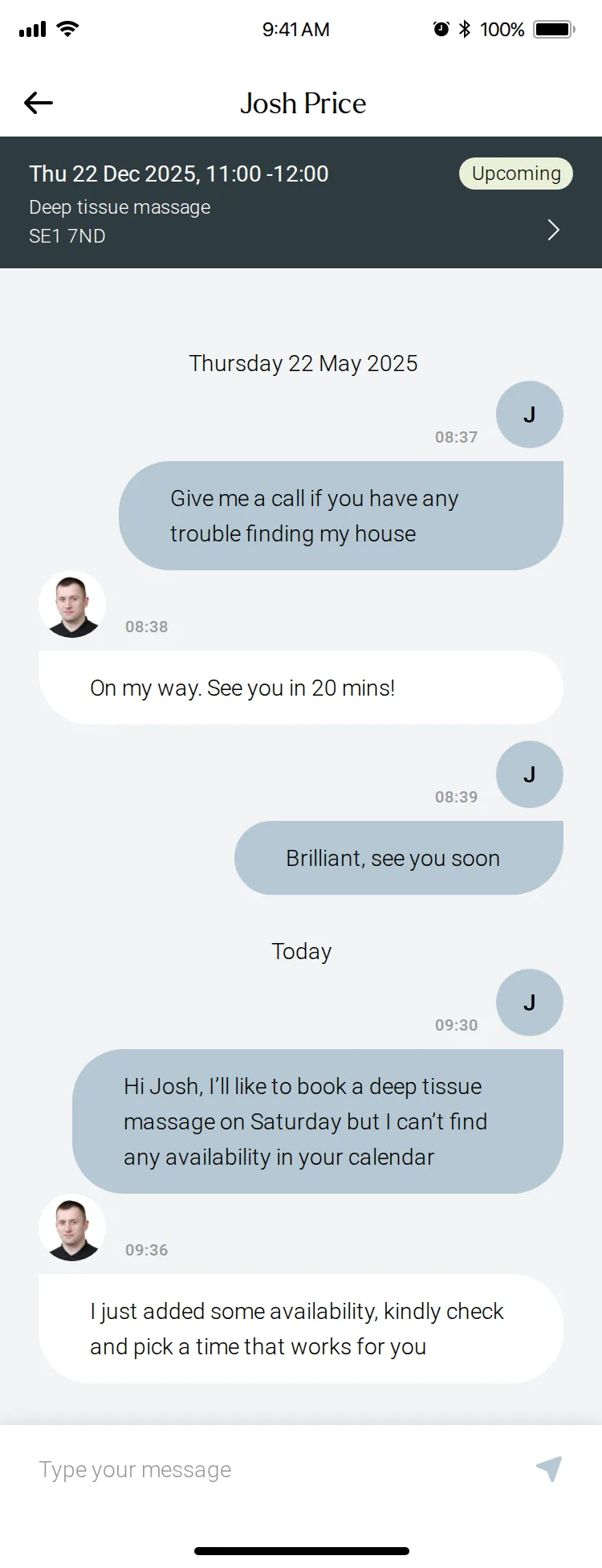
On the customer side, Request to Book let people ask for a time their practitioner hadn’t put in their diary. That only works if the practitioner sees the request, judges it quickly and can say no.
See the customer side in the Urban case study →The problem
- Customers could only book hours practitioners had committed in advance
- A free practitioner could still be invisible in search
- The workaround was a chain of messages between both sides
- Slow replies lost bookings
What I designed for practitioners
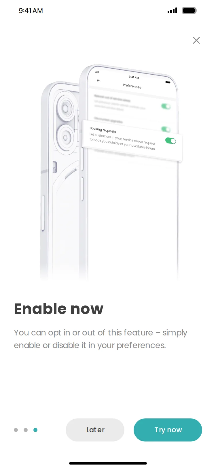
- An opt-in switch for booking requests in Preferences
- A Requests tab with a count of what’s waiting
- An expiry time on every request
- Review in the layout of a confirmed booking
- Accepted requests that join the diary like any booking
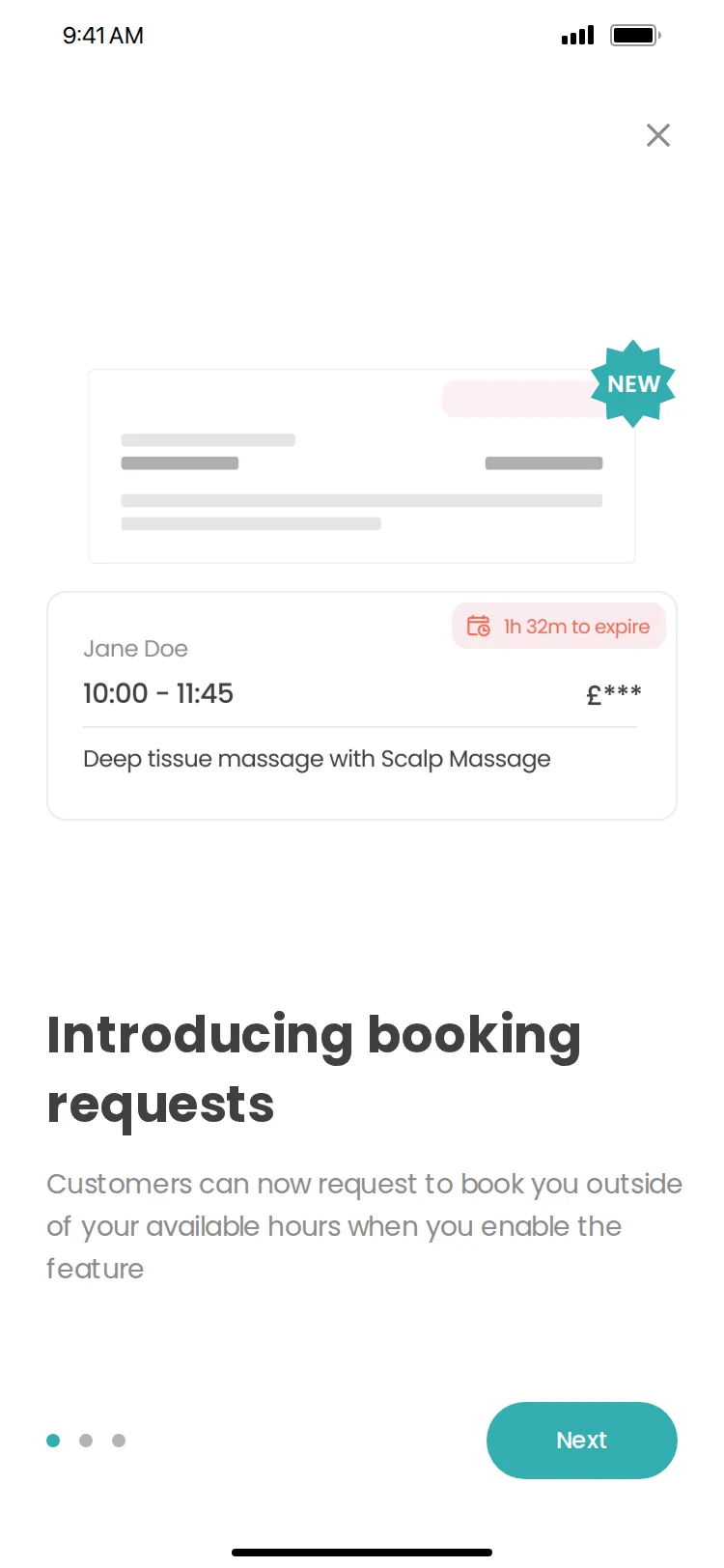
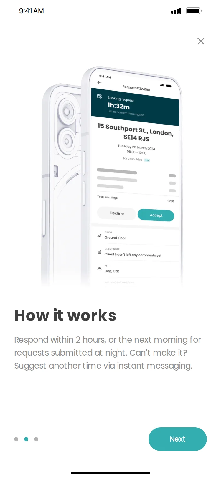
Introducing the feature
Three short steps explain what changes, how responding works, and that it’s the practitioner’s choice. The last one opens Preferences, so turning requests on is one tap away.
The Pro workflow
From opting in to checking in
- 01Learn and opt in
Three onboarding steps, then the Booking requests switch in Preferences.
- 02See requests arrive
Requests sit in their own tab beside Upcoming and Past, with a count of what’s waiting.
- 03Review, then accept
The countdown leads the screen. Everything else matches a confirmed booking.
- 04Run it like any booking
Accepted, it joins the diary. On the day, sliding to check in starts the booking.
Requests in context
Judged against the rest of the day
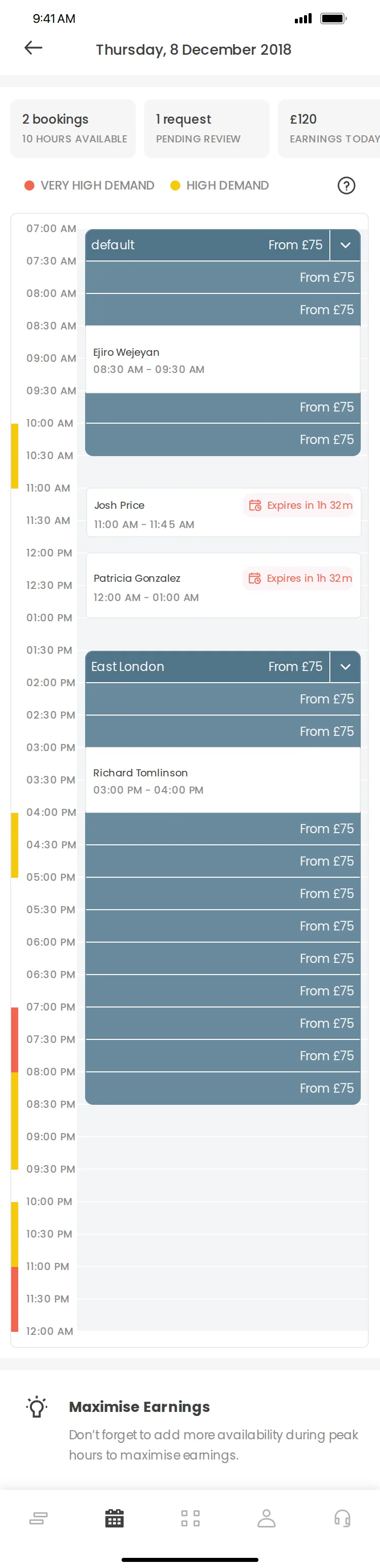
A request only makes sense next to what’s already booked. The diary shows requests in the timeline beside committed hours and confirmed bookings, each with its expiry, with the day’s bookings, pending requests and earnings summarised at the top.
Demand colours on the timeline show which hours are busiest, so practitioners can see where extra availability is most useful.
Pro App redesign
Rebuilding the practitioner’s daily tools on a new platform
The brief
The Pro app was one of four surfaces rebuilt in Urban’s three-month redesign, alongside the move to ServiceOS. ServiceOS came with its own component framework, documented mostly as images in Zeplin. I turned it into a working Figma foundation, then redesigned the Pro app task by task.
See the customer app Urban case study →Availability, on their terms
On the job
Booking details, then one live view for the visit
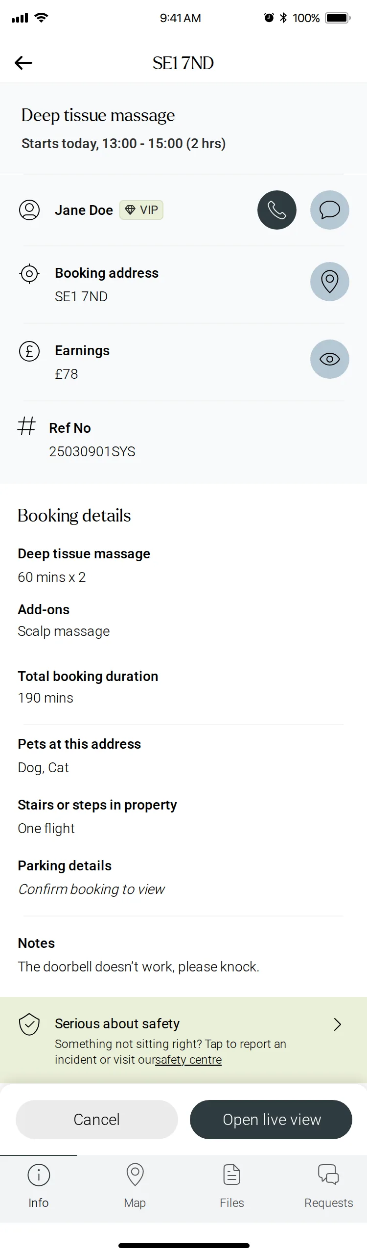
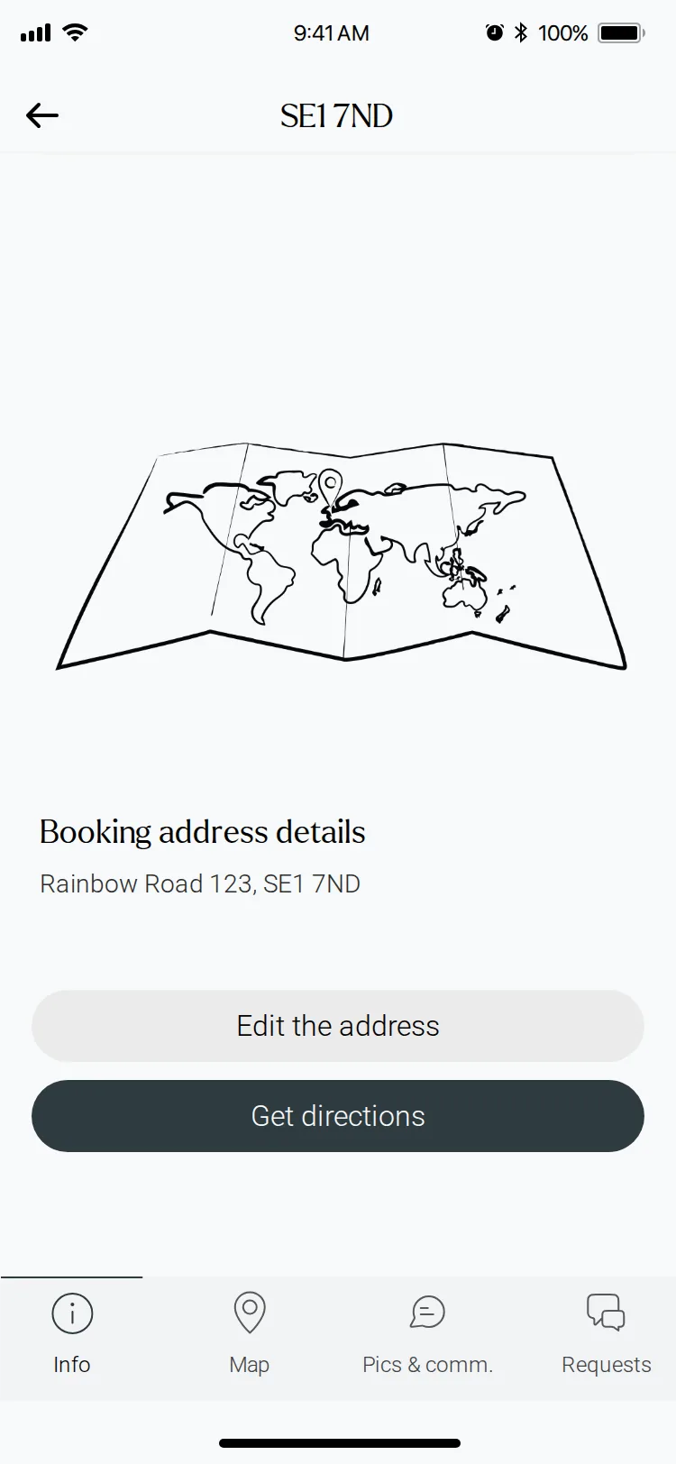
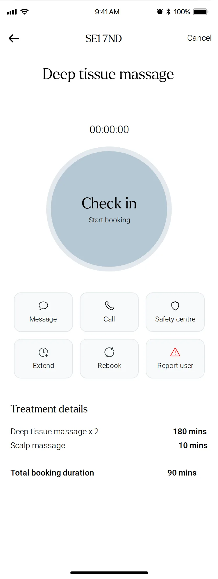
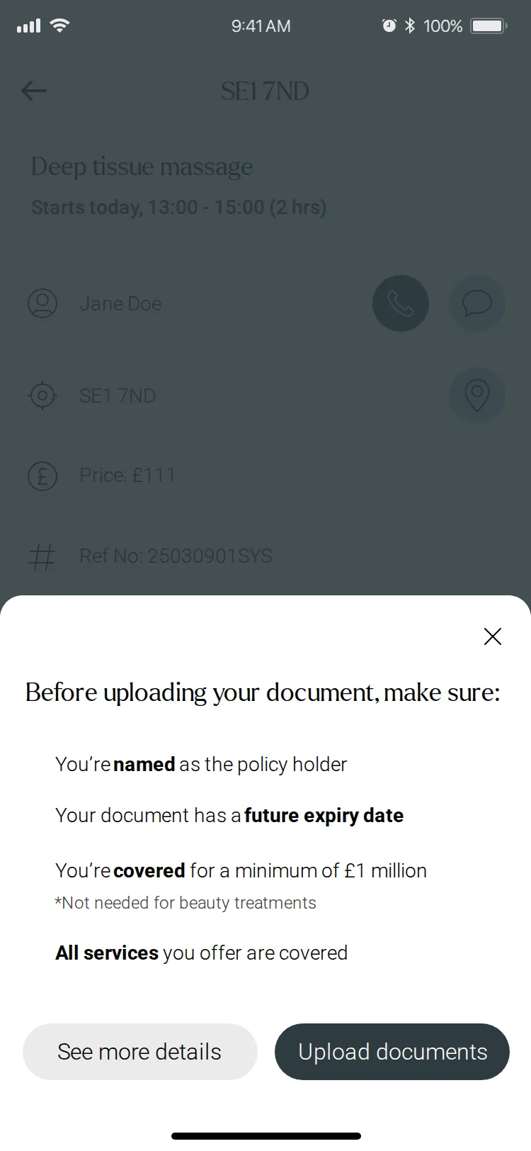
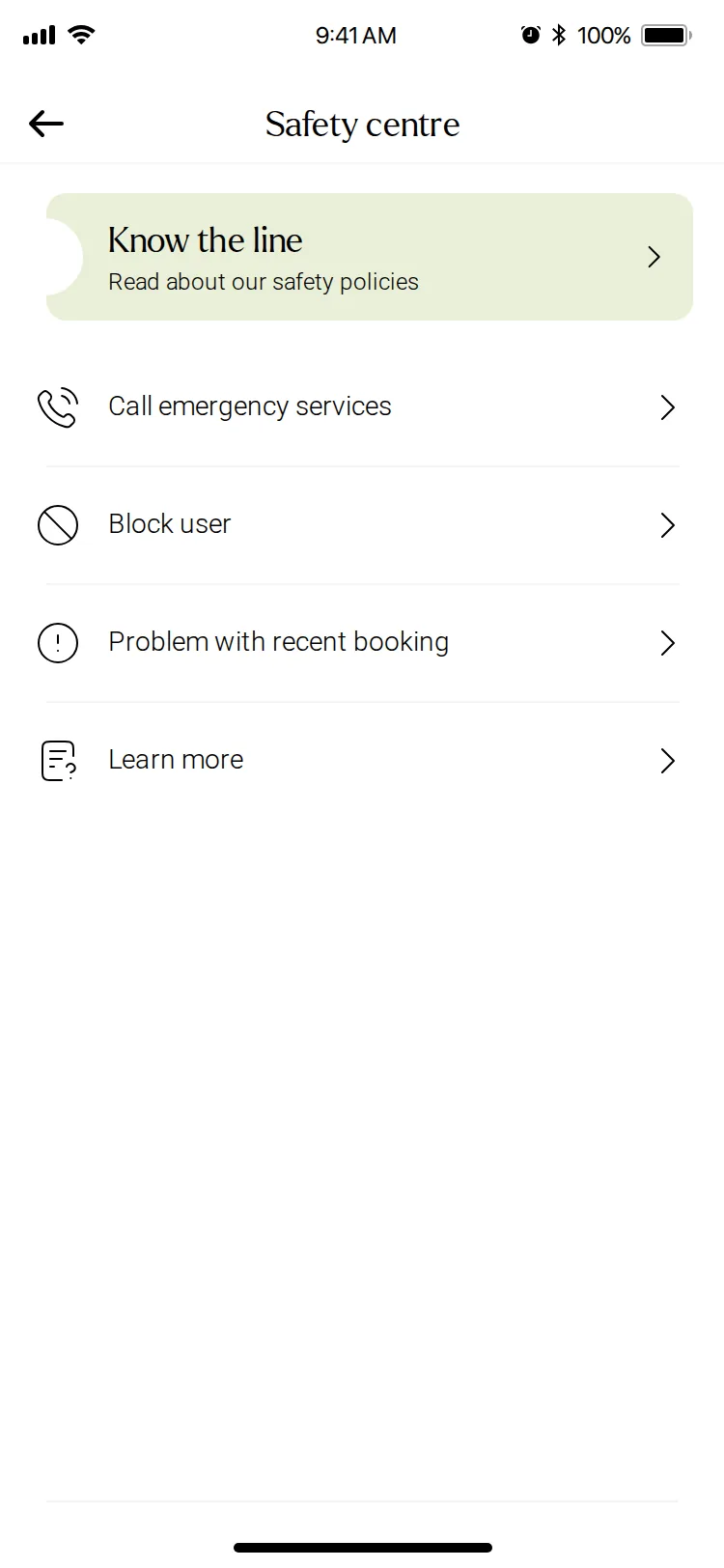
Booking details group the client, address, earnings and reference, then the treatment, add-ons, pets, stairs, parking and notes, with a safety prompt at the end.
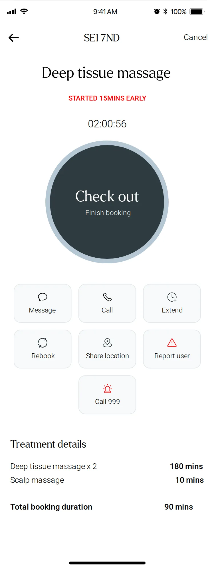
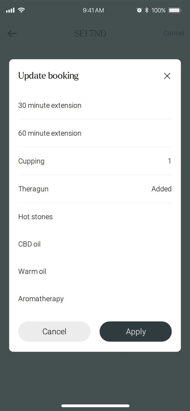
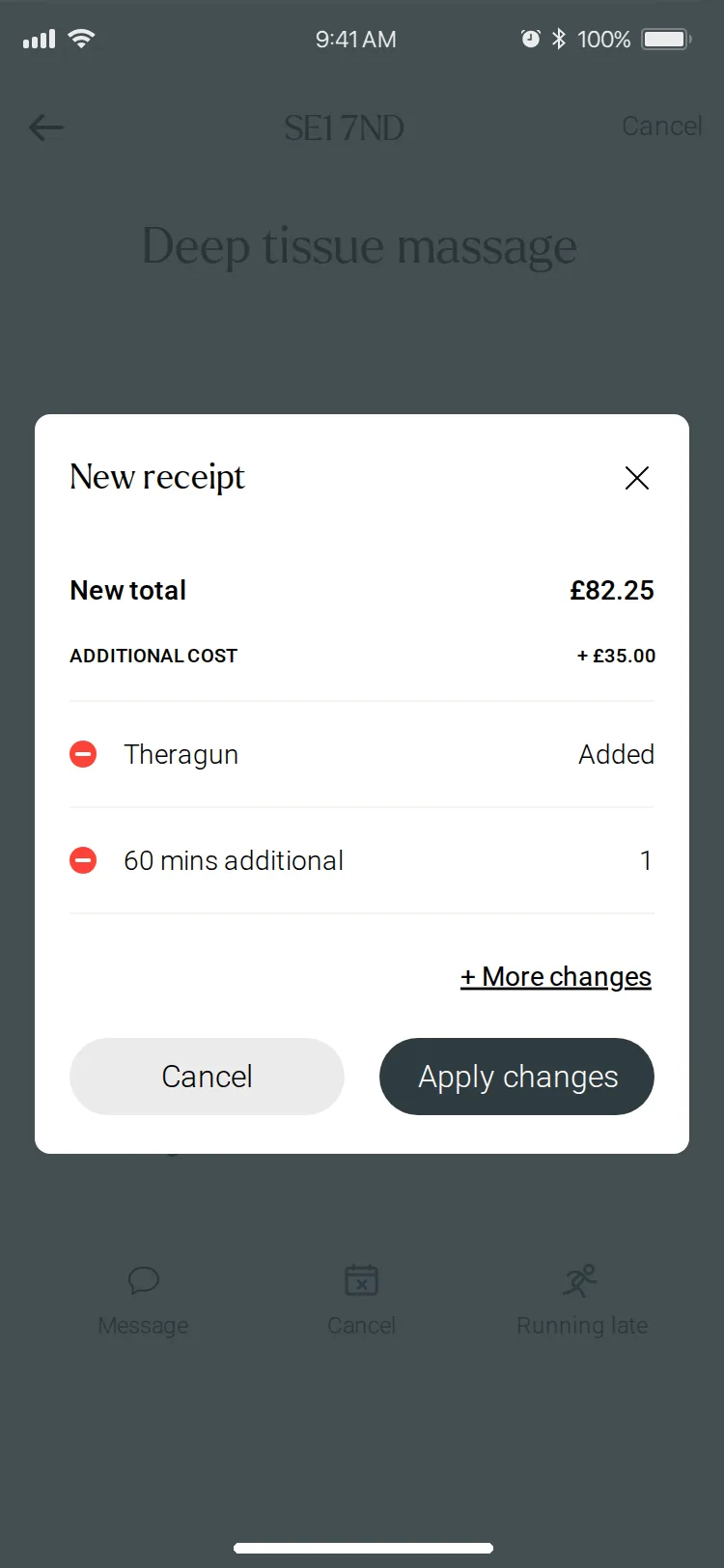
Opening the live view turns it into a working screen: a large Check in button, then Check out with a running timer. Extending the visit happens there too, with the new total shown on a receipt before anything changes.
Availability and service areas
Where they’ll work, saved as templates
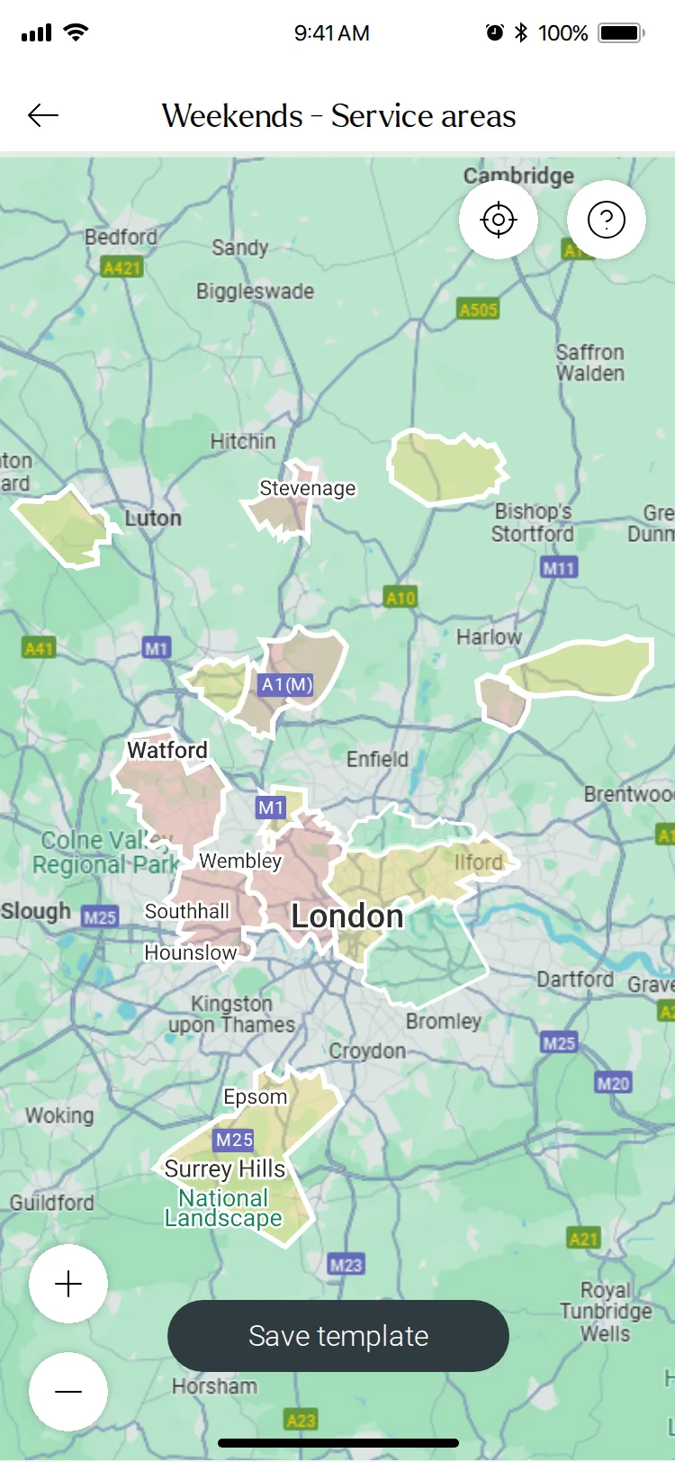
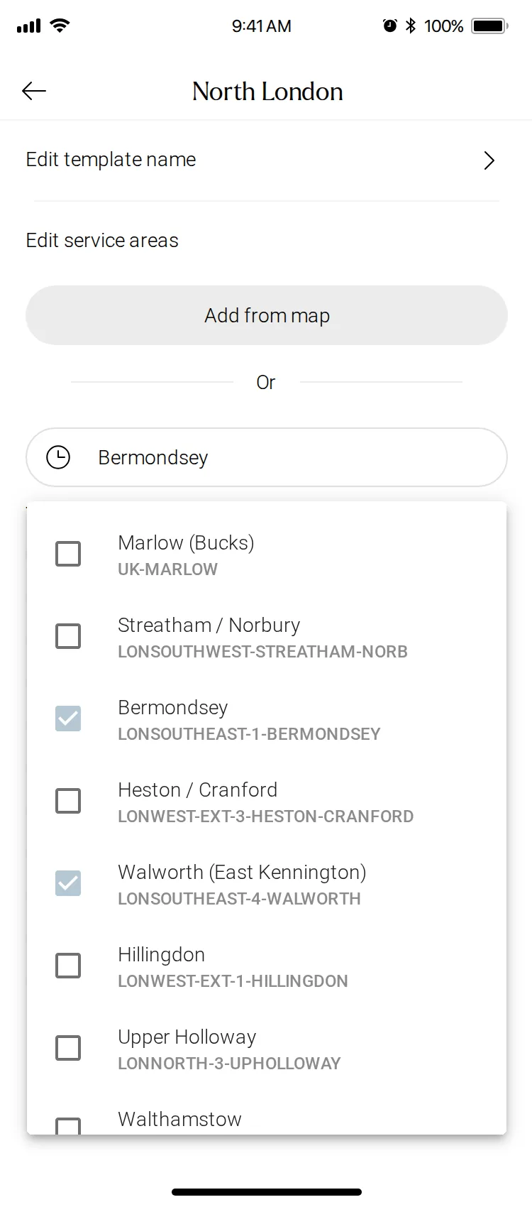
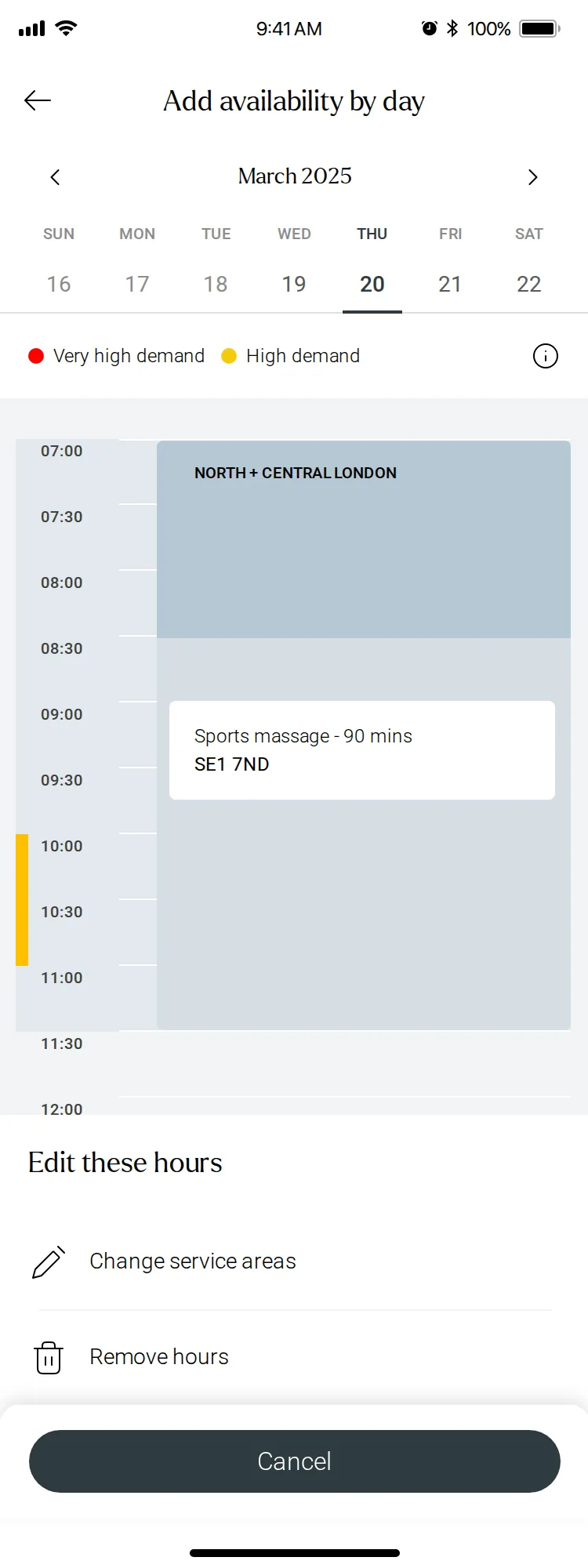
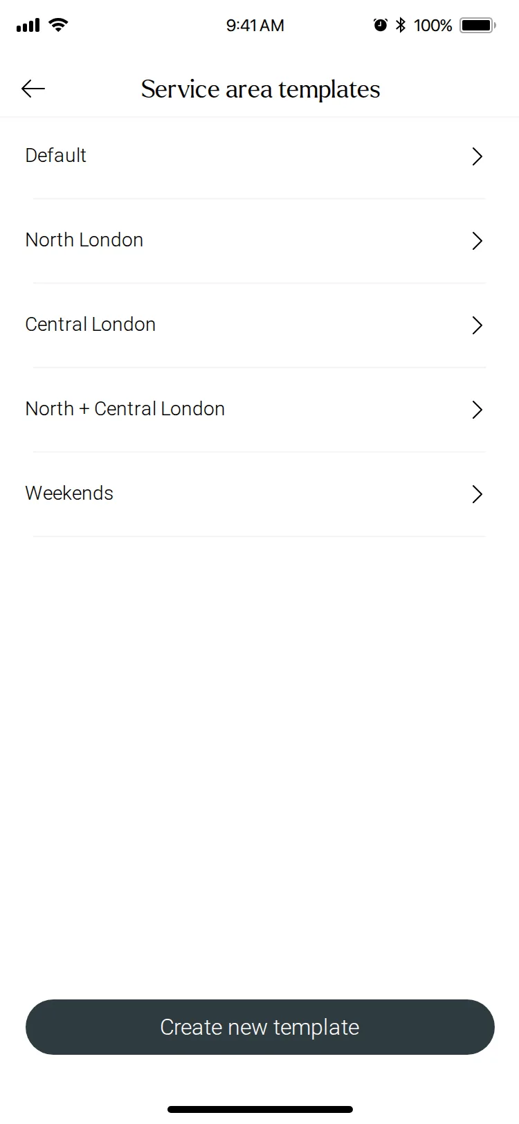
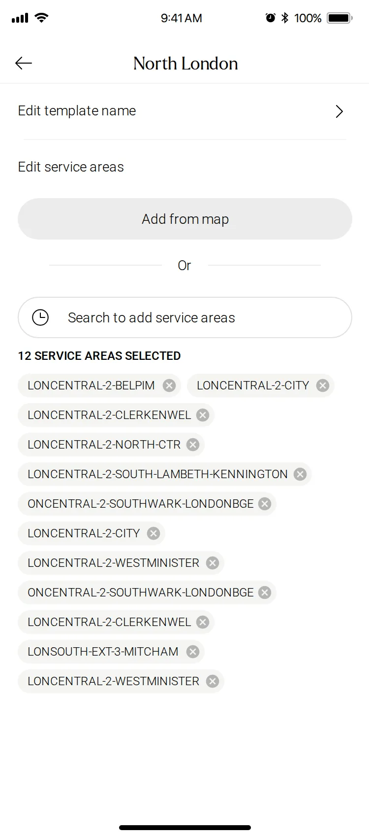
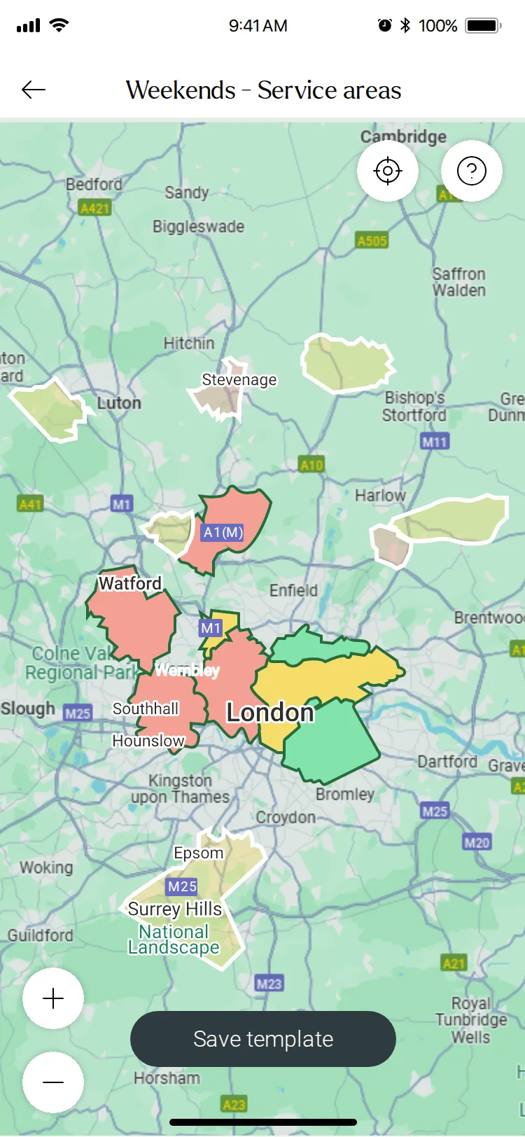
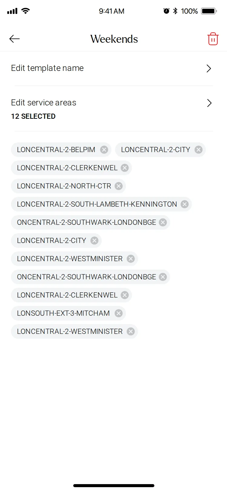
Where a practitioner will travel changes with the day, so service areas became named templates such as Weekends or North London. Each one is picked from a map or found by search, then applied when adding availability.
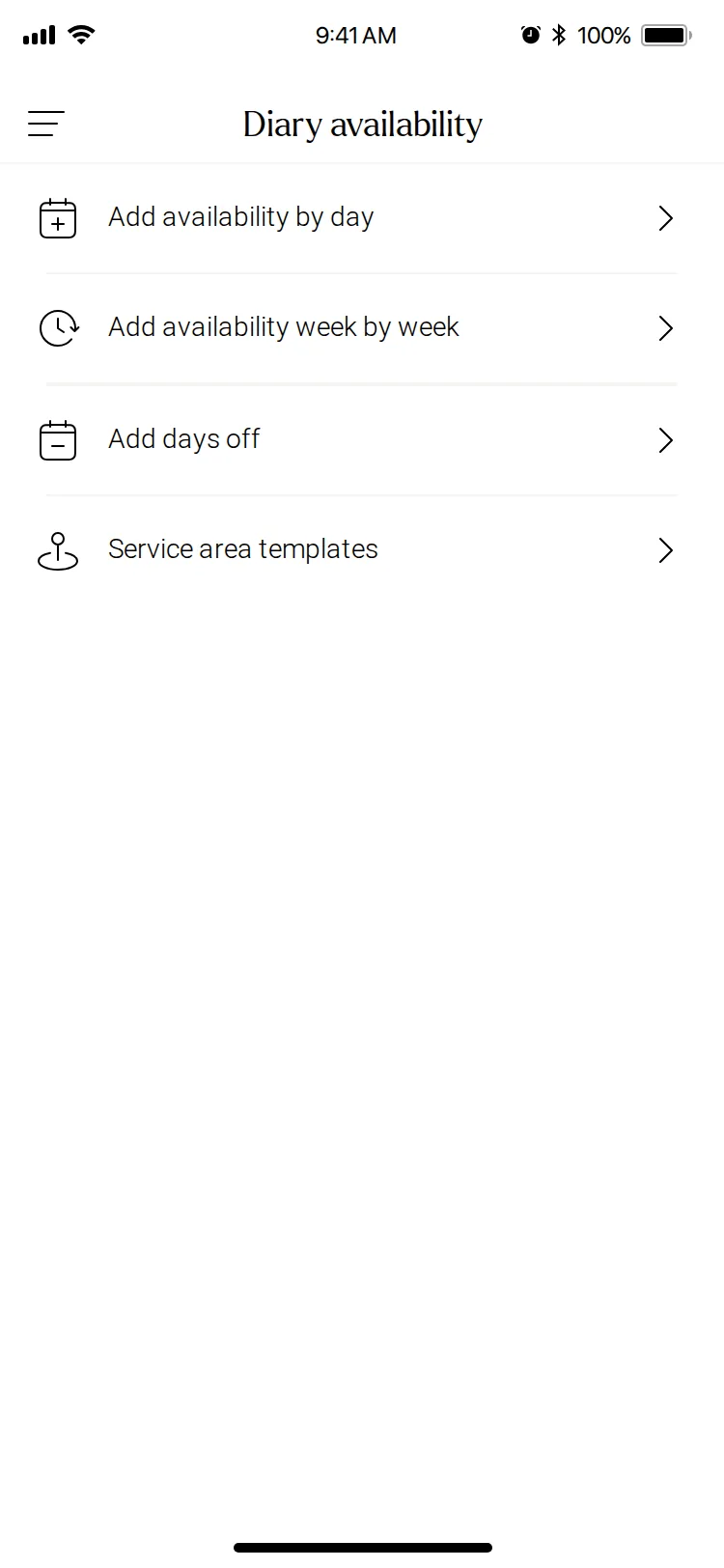
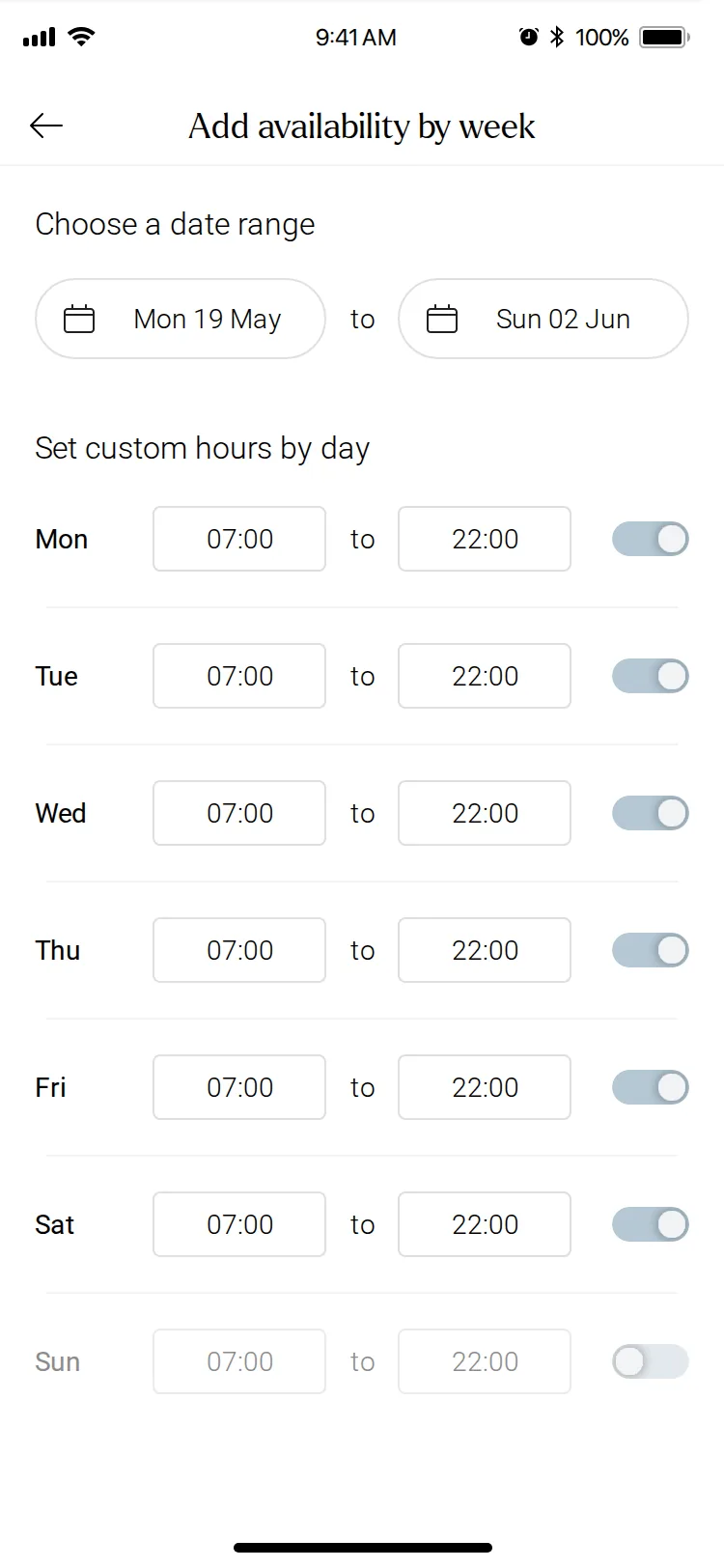
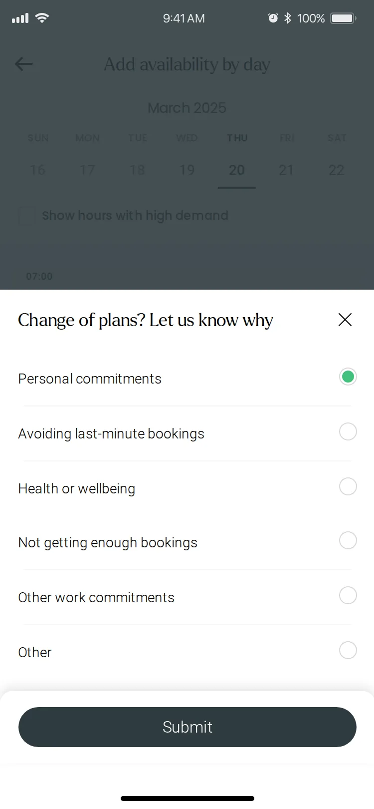
Availability itself has four ways in, from one menu: by day, week by week, days off, and service area templates.
My role
Primary designer for the Pro app through the migration. I designed the practitioner experience end to end: mapping the existing app, finding the gaps against ServiceOS, defining interaction patterns, and building the design system foundations the Pro app shared with the customer apps.
The final product
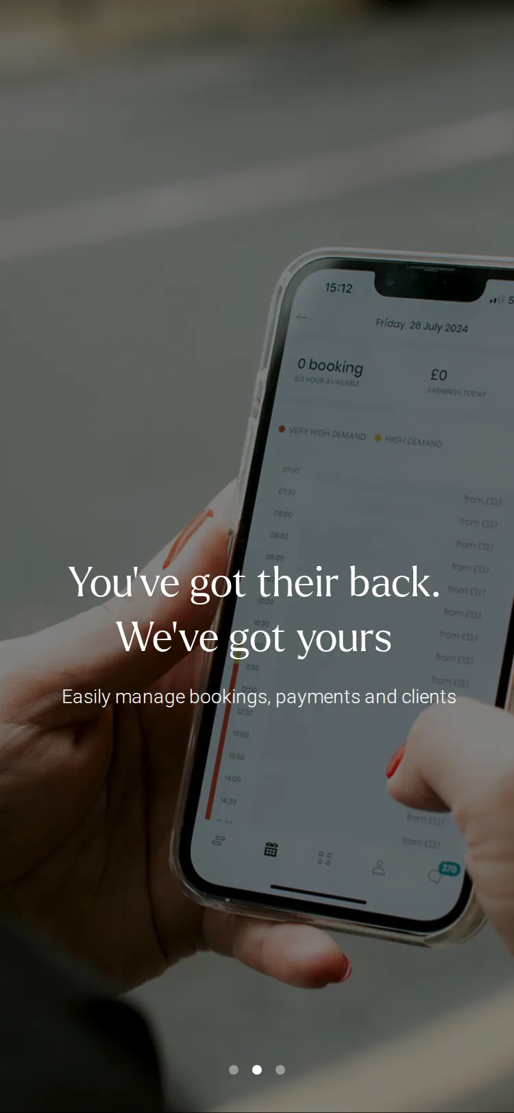
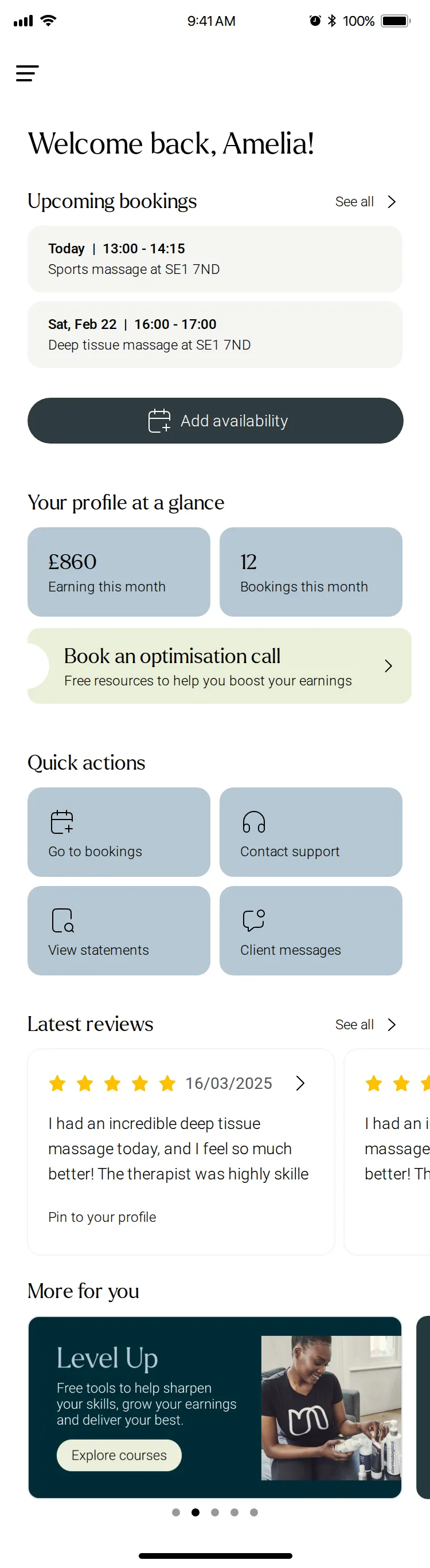
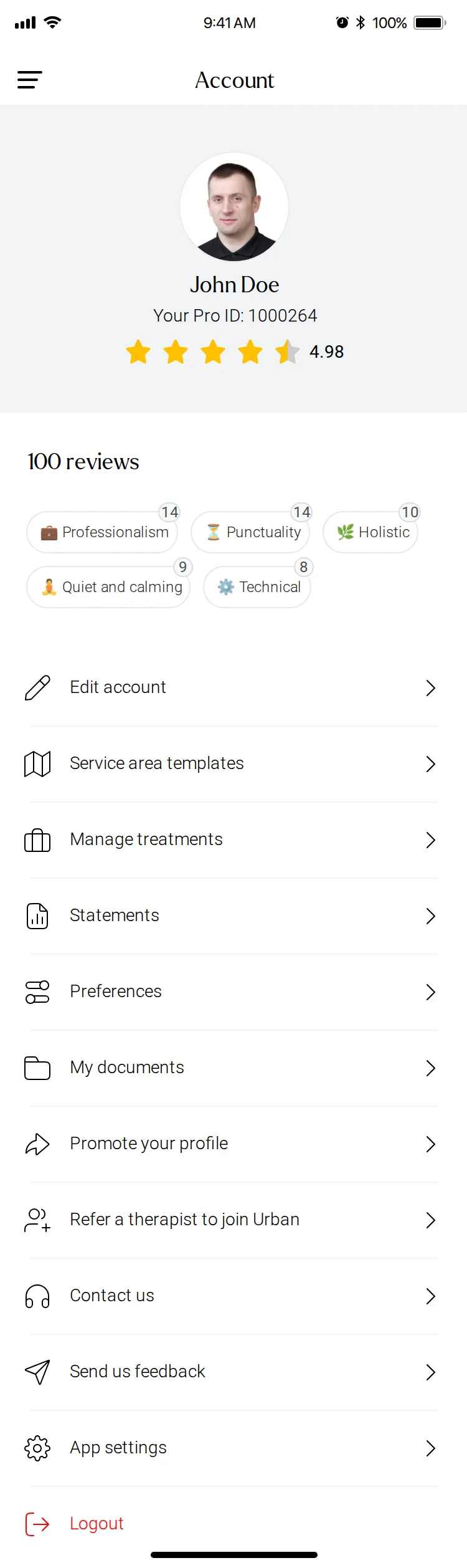
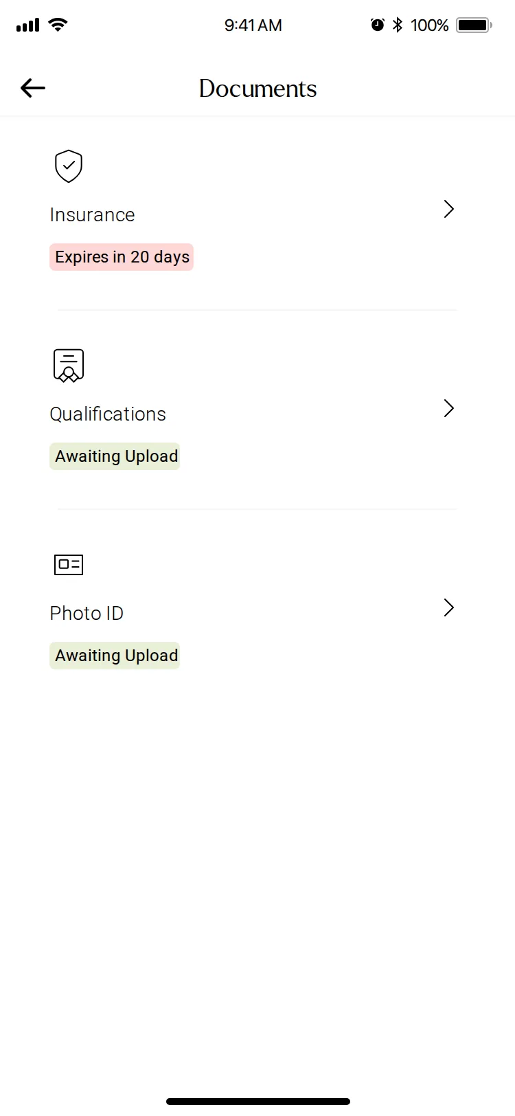
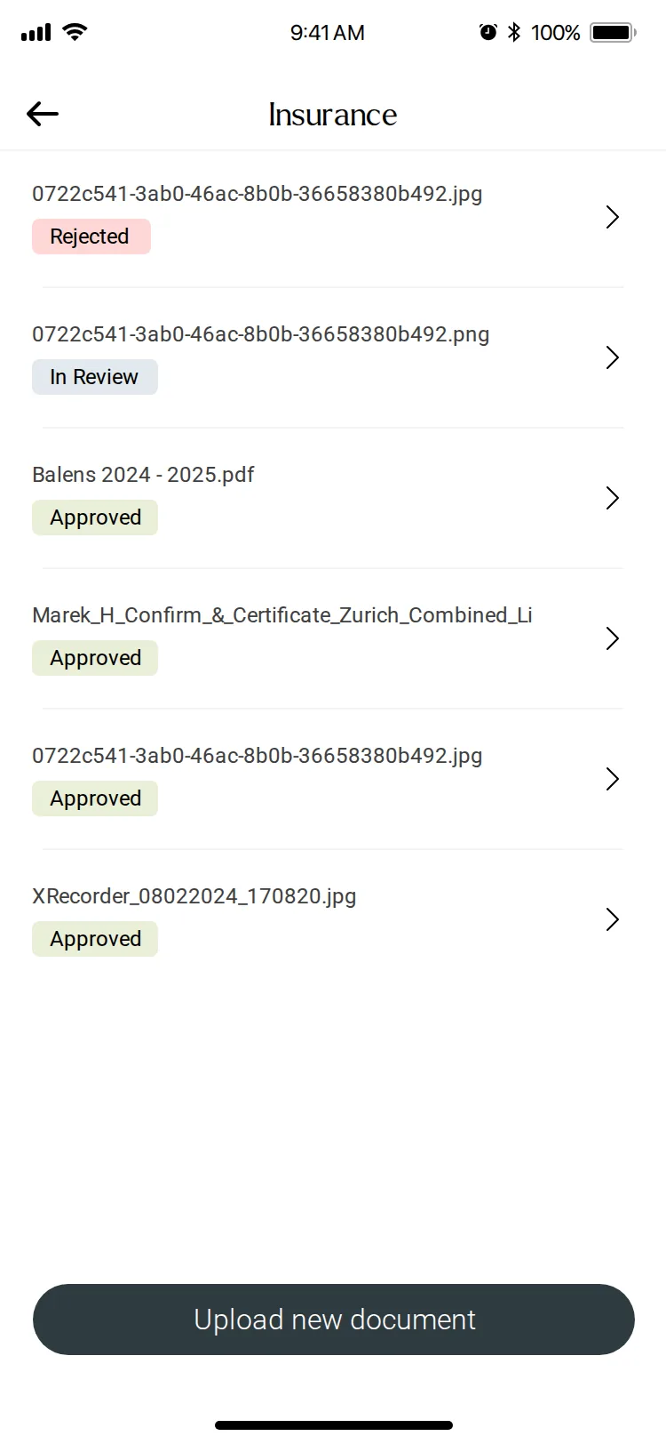
The Pro app, from first launch to payday
Outcome
A redesigned Pro app on ServiceOS, delivered within the three-month redesign.
Built on the same foundation as the customer apps, so both sides of a booking now share one design language.
What this work taught me
Three lessons from the other side of the booking
- 01
Every feature has two sides
A request only became a booking if a practitioner answered it. Giving that side the same care, with a clear list, the full booking and an easy way to decline, was the real work.
- 02
Control earns adoption
Asking practitioners to take work outside their hours had to start with their consent. Opt-in, a visible countdown and an equal Decline kept the decision theirs.
- 03
A migration is a chance to unify
Rebuilding on ServiceOS meant every Pro task was being touched anyway. Using that moment to apply one visual language made the app feel like a single product, not a set of screens.
Urban is only as good as the practitioners who turn up. The Pro app is where they plan, decide and work, so the question behind every screen was the same:
How do we make the practitioner’s side of a booking as clear and calm as the customer’s?
Other case studies
More work